Tools
Services
About the project
Meddiktat is a medical dictation platform that helps doctors convert speech into structured medical records. I worked on the UX and UI to simplify the workflow, improve accuracy feedback, and ensure accessibility on both desktop and mobile devices.
Goal
Doctors waste valuable time on manual data entry or correcting dictation errors. The goal was to design a focused, intuitive interface that allows doctors to dictate patient notes quickly and confidently all without training or explanation — reducing friction and improving documentation quality.
Process & Decisions
Research & Constraints
I started by speaking informally with two physicians about how they document today. A few patterns stood out:
- They don’t want to touch the screen more than necessary
- Real-time transcription is useful, but only if it’s reliable
- Most errors happen when the tool misunderstands a word — and correction workflows are tedious
From there, I reviewed existing tools used in clinics and noted key gaps:
- Hard to access – installation is usually handled by IT; setup is slow and rigid
- Outdated UX – interfaces feel clunky and are not designed for modern workflows
- Lack of intelligence – most tools just directly transcribe speech without smoothing, structure, or prioritizing clarity
- Poor mobile support – limited or no mobile-first options, even though many doctors rely on tablets and phones throughout the day
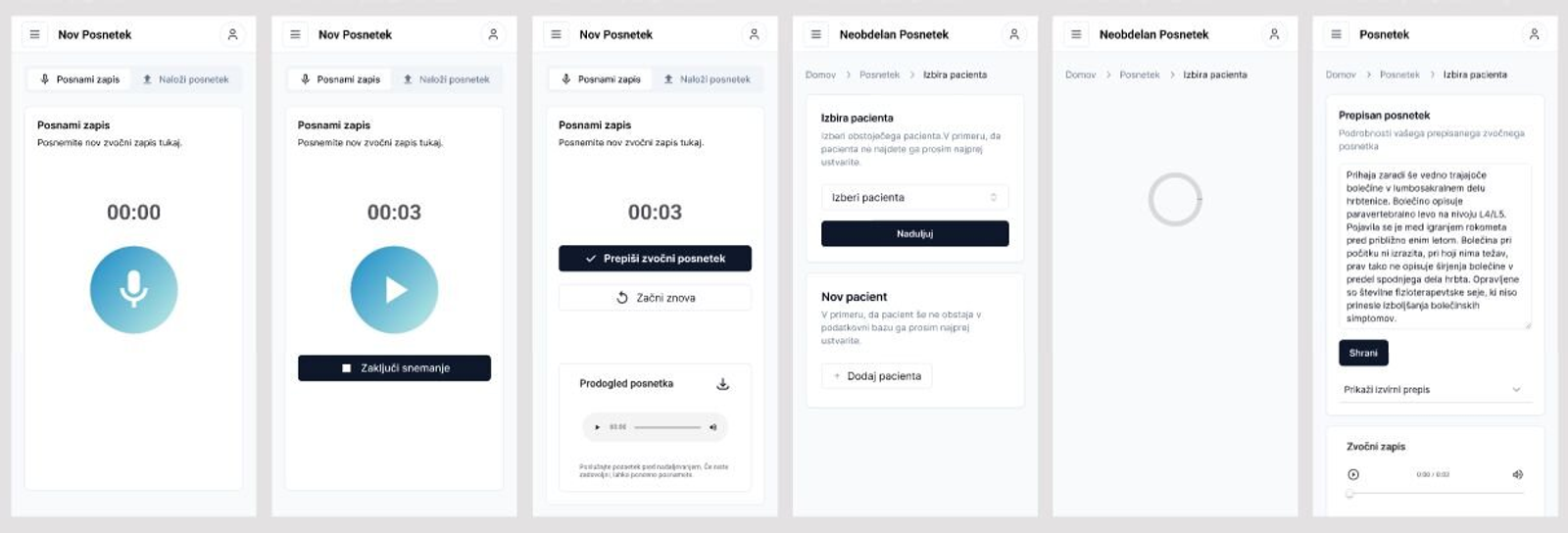
Designing the Flow
I mapped a 3-step user journey: Dictate → Review → Edit & Export
I sketched wireframes for both mobile and desktop, prioritizing:
- One-tap recording
- Visual feedback during speech
- Simple correction without typing (e.g. tap-to-edit)
Visual Design
The UI is clean, muted, and distraction-free. I used subtle colors for feedback states (e.g. grey for captured text, yellow highlights for unsure words). Typography is large and readable, especially on mobile.
Outcome
The final design is a minimal dictation interface that fits naturally into a doctor’s day. It supports quick, confident note-taking without pulling attention away from the patient.
Reflection
This project pushed me to focus on flow and trust — not features. Designing for professionals in time-sensitive, high-stakes environments means every second matters. UX has to get out of the way and support real work, not distract from it.