Building My Design System – Part 1: Color Variables
When I wrote about starting my own lightweight design system in the last post, I mentioned I wanted something that could work across different brands and projects without being overwhelming. The first step in making that possible is setting up the variables in Figma — and it made sense to begin with colors.
Not because it’s some groundbreaking approach (it’s what most people start with), but because colors are everywhere in UI work — backgrounds, text, icons, borders — and they’re the easiest way to test if the whole “plug-and-play” system actually works. If you don’t set them up properly from the start, you end up chasing hex codes later and fixing inconsistencies by hand.
Been there, done that, don’t recommend.
Why Variables?
Figma’s variable feature lets you define reusable values (like hex codes, spacing units, font sizes) and reference them throughout your designs. The magic? Change the value once, and it updates everywhere it’s used.
For colors, this means:
- No more hunting for the right shade in old files
- No more replacing colors manually in 50 components
- The flexibility to switch to a new brand palette in minutes
It’s the difference between designing with intention and designing on the fly.
Step 1 – Primitives: The Raw Color Values
Primitives are your source colors — aka the actual hex codes you start with. They don’t have a “meaning” yet in the UI; they’re just the raw materials.
Think of primitives as your paint tubes before you decide where each color will go on the canvas.
In my Figma file, I created a variable collection called primitives with:
- Brand – the main brand color in a range of tints/shades from 100 (lightest) to 900 (darkest).
- Grayscale – white, black, and shades of grey (essential for backgrounds, borders, text).
- Status colors — red (error), orange (warning), green (success), and blue (info).
- Each color scale has its middle shade (usually 500) as the “main” color, with lighter and darker shades above/below.
Why these? The way I approached it: think about the colors you always end up using across UIs, regardless of the project. For me, that’s a brand color palette, neutrals, and status colors.
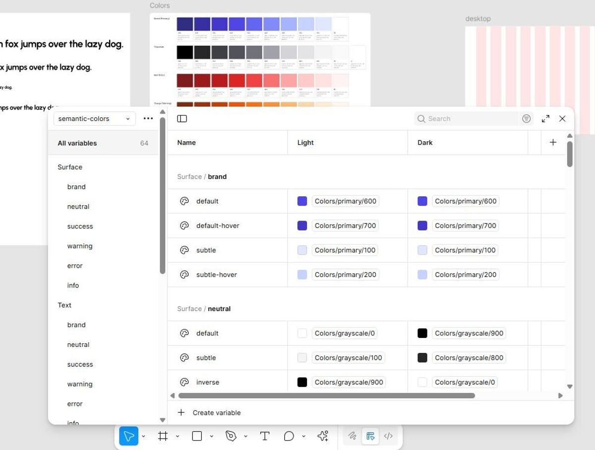
Step 2 – Semantics (Tokens): Giving Colors Meaning
While primitives are just raw values, semantic colors describe how and where a color is used in the interface. Instead of assigning #0D6EFD to a button, you’d assign brand/default.
Why? Because when your brand color changes, you just swap the primitive value, and every place that uses brand/default updates instantly — without touching the components.
My semantic collection (semantics-colors) is structured by purpose:
- Surface – backgrounds for cards, sections, modals, etc.
- Text – primary, secondary, inverse, disabled text styles.
- Icon – default, subtle, and state-specific icon colors.
- Border – default and subtle border styles.
Within each, I included:
- Brand / Neutral / Success / Warning / Error / Info
- Variants like default, subtle, and hover (for brand).
- Additional states like inverse and disabled (for neutral).
For semantics, I also set up two modes: light and dark.
This way, each token has a value for light mode and a value for dark mode.
Want to flip your entire UI to dark? Just switch modes — all surfaces, text, borders, and icons update instantly.
How It Works in Practice
Imagine you’ve built a dashboard for Client A with a deep blue brand color. Next month, you need to adapt the same UI for Client B, who has a bright orange palette.
If you designed everything using hex codes directly, you’d spend hours swapping colors in dozens of components.
If you designed with semantic tokens linked to primitives, you’d just change the brand primitive hex value and you’re done. Everything updates: buttons, text, icons, backgrounds.
The Chicken-and-Egg Problem
Here’s the catch: you don’t really know all the tokens you’ll need until you start building components.
I started with what I thought made sense — then, once I designed my first few buttons, inputs, and alerts, I realized I needed a couple more states and variations. So this setup is not final; it will evolve alongside the system.
The key is not to overthink it now. Create a solid starting point, test it with a few real components, and refine as you go.
What's Next
With colors sorted, I’ll be moving on to other variables — typography, spacing, radii — before building out the core components.
Once the system is far enough along, I’ll share the Figma file on my site as a free resource. So if you want to follow along as this evolves (and grab the file when it’s ready), stick around for the next post.