Building a Design System for Myself — So I Never Start from Scratch Again
When I started working on smaller projects—marketing pages, dashboards, simple landing pages—I often thought, “Do I really need a full design system for this?” For big brands or complex apps, design systems make perfect sense. But for smaller gigs, they sometimes feel like overkill. So I kept designing as I went, or copying components from previous projects when I remembered to. That worked… until it didn’t.
After juggling multiple projects over time, I realized this approach was slowing me down more than it was helping. I’d waste time digging through old files to find that button style I liked, or hunt for consistent spacing rules. Sometimes I’d just rebuild UI elements from scratch because it was easier than hunting down the “right” version. Inevitably, inconsistencies crept in.
I’d used popular UI libraries like MUI and Tailwind in some projects, and even leaned on community Figma design systems. Those were helpful to a degree, but I wanted something lighter, simpler, and most importantly, mine. A core toolkit with just the elements I actually use—buttons, inputs, alerts, spacing rules—that I could reuse across my typical projects without fuss.
Figma’s variables have been around for a while, and I’ve used them before, but I hadn’t fully tapped into their potential until now. They’re a perfect way to build a design system that’s not only reusable but truly adaptable. With variables, I can create a single Figma file where swapping brand colors, typography, spacing, and border radii automatically updates every component. Plug and play. Want to create a new brand style or project theme? Just change a few primitives, and the whole system adjusts.
That’s the vision I’m chasing.
Why Build My Own Design System?
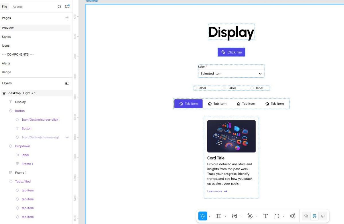
The projects I work on share a lot of the same building blocks. Marketing pages need clear buttons and calls to action. Dashboards need inputs, alerts, consistent spacing. Landing pages need clean grids and cards.
Having a shared system speeds up my work and keeps everything consistent. I’m less distracted by design details that don’t matter and more focused on what makes each project unique.
This isn’t about making something perfect right away. It’s about building a living, breathing foundation that grows with my skills and project needs.
What’s in the System?
I’m starting small and practical. Right now, that means:
- Core variables: colors (primary, secondary, neutrals), typography scales, spacing increments, border radius, shadows.
- Essential components: buttons in different states, input fields, checkboxes, alerts.
- Layout elements: grids, cards, navigation bars.
- Patterns: form layouts, modals, page headers.
These are the pieces I use most frequently. Once those are solid, I’ll expand or customize as needed.
The Mindset Shift
Building a personal design system isn’t about locking myself into rigid rules or endless libraries of components I don’t use. It’s about having a flexible toolbox tailored to my workflow.
It’s liberating to know I can pick and choose what’s relevant for each project, and quickly adapt the system to new brands or styles without rebuilding from scratch.
Plus, it makes work more enjoyable and less repetitive.
What’s Next?
Over the coming weeks, I’ll be sharing more about the process—how I define core variables, build components, handle layout, and adapt the system per project.
I’ll also share my Figma file as a free resource when it’s ready, so you can use it or adapt it for your own projects.
If you’ve ever felt bogged down by rebuilding UI elements over and over, or want a flexible way to work smarter, I hope this journey will be useful and inspiring.
Follow along. Let’s make design easier and more efficient together.