Ad Art Sign Co.
Redesign and CMS integration for a multi-site platform, focusing on UX/UI, reusable block templates, and lead qualification.
Tools
Services
About the Project
This project involved redesigning and consolidating multiple websites for Ad Art and Making-Light, two divisions with distinct offerings in signage and lighting. The challenge was not only to modernize the visual design but also to create a seamless user experience across multiple domains, catering to different customer types while enabling subtle cross-selling opportunities. My role spanned UX/UI design and product management, overseeing the project from content analysis and user research to high-fidelity prototypes and collaboration with the development team for Payload CMS implementation.
Goal
The primary goal of the project was to improve the overall user experience and navigation, helping different types of customers quickly find relevant solutions and products. At the same time, the website was intended to serve as a tool for lead qualification, capturing user intent and directing inquiries to the appropriate team while establishing urgency and context. A secondary objective was to design a flexible system capable of supporting two distinct product divisions — signage and lighting — in a way that felt cohesive and consistent from a brand perspective.
Process
Content Audit & Strategy
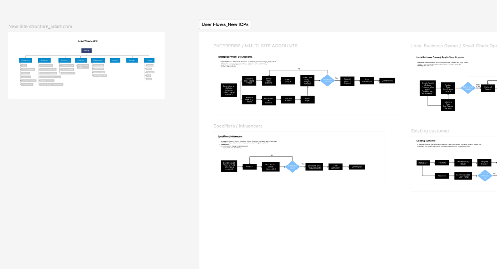
The project began with a detailed audit of all existing websites and digital assets. I reviewed content, page structures, and navigation to identify gaps, overlaps, and opportunities for consolidation. At the same time, we mapped ideal customer profiles (ICPs) to understand user needs, which informed content prioritization and the structure of each domain.
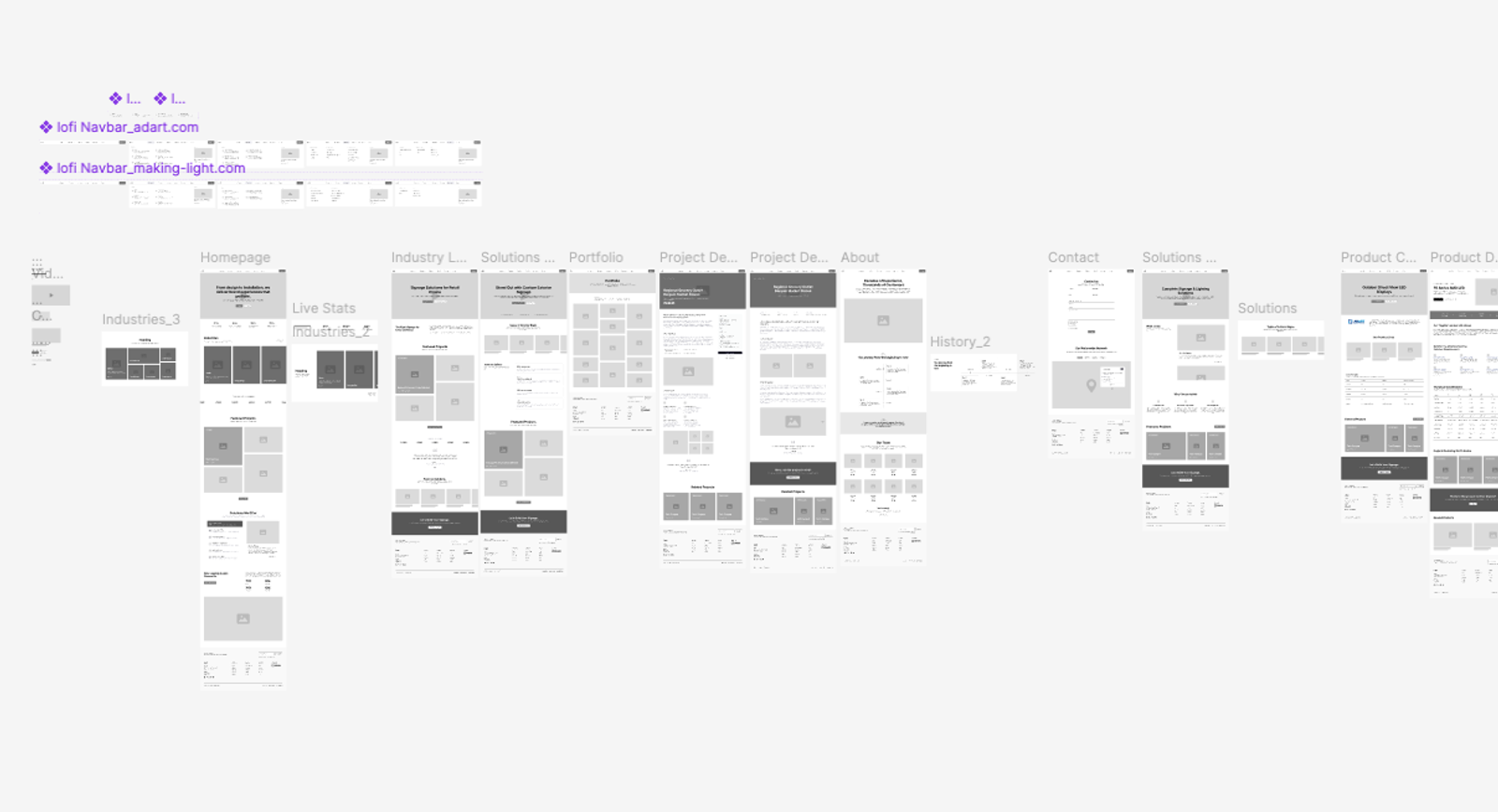
Wireframing & UX Design
Low-fidelity wireframes were created to outline layout, hierarchy, and key interaction points. These wireframes allowed quick exploration of navigation flows, user paths, and solution/product structures for both signage and lighting divisions. Iterations were made internally before presenting to the client, ensuring alignment with their objectives.
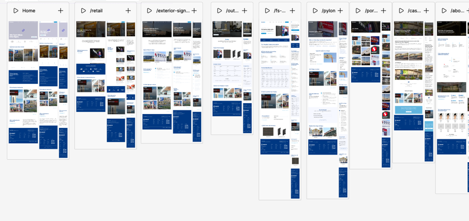
High-Fidelity Mockups & Interactive Prototypes
Once the wireframes were approved, I developed high-fidelity Figma prototypes incorporating visual hierarchy, branding, typography, and interaction cues. Responsive layouts were designed for desktop, tablet, and mobile, with interactive elements and hover states to demonstrate navigation flows and CTAs. This step allowed the client to experience the website in a near-final form before development began.
CMS Integration & Frontend Alignment
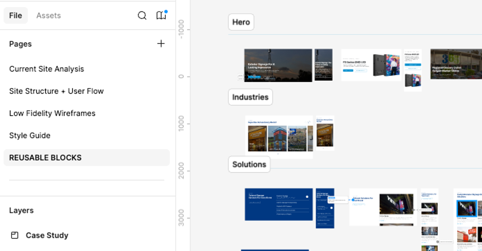
The design was implemented in Payload CMS, which uses a block-based system. My task included grouping and organizing blocks into reusable templates—hero blocks, feature blocks, content sections, and more—so that in the future the client can easily add new pages or variations themselves without needing developer support. After initial implementation, I also polished the blocks/components directly in code to ensure they matched the wireframes and the client’s vision, fine-tuning spacing, typography, and interactions for a pixel-perfect and cohesive user experience.
Testing & Iteration
Throughout development, iterative testing ensured the website maintained usability, responsiveness, and performance across devices. Special attention was paid to the lead qualification flows and AI-powered chat, verifying that each user type could navigate intuitively and reach the correct contact points.
Result
The project successfully launched with a modern, responsive, and user-centered design across all devices. Each division — signage and lighting — now has a tailored experience, presenting relevant solutions and products while subtly promoting the other division where appropriate. The platform supports lead qualification through forms and AI chat, guiding inquiries to the right team with context and priority, which has helped the client streamline their sales process. Visual clarity, interactive elements, and accessible design principles were embedded throughout, creating a cohesive experience for both end users and the internal team managing the site.
Reflection
This project reinforced the importance of balancing complex business requirements with a clean and intuitive user experience. Designing for multiple customer types, while accounting for cross-domain navigation and lead qualification, challenged me to think strategically about content hierarchy, information architecture, and interaction design. I learned a great deal about the opportunities and constraints of multi-domain CMS setups and how early alignment on ICPs and user flows can dramatically improve both design and business outcomes. The project also highlighted potential future enhancements, such as analytics-driven navigation improvements and interactive tools to further guide users toward solutions.