The Case for Boring Design: Why Function Beats Flash for Most Businesses
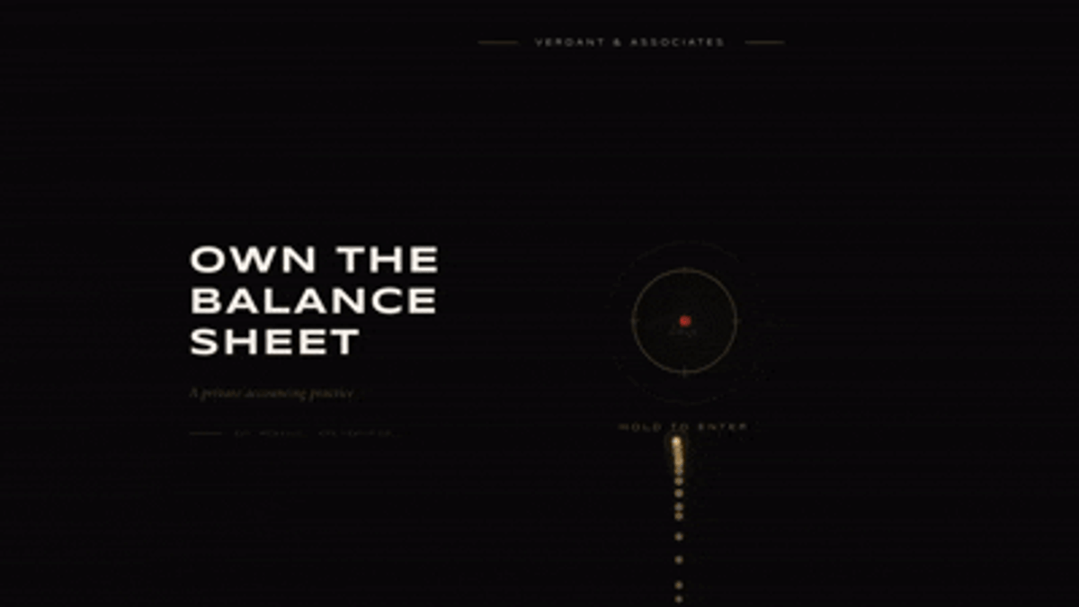
You have probably landed on one of these websites. A full screen video that plays before you can do anything. A 3D object rotating slowly in the hero. Text that reveals itself letter by letter as you scroll. Click to enter. A loading screen for a company website.
It looks impressive. Someone clearly put a lot of thought into the experience. But two minutes later you are still trying to figure out what they actually do, what it costs, and how to get in touch.
This is not a new problem. Award sites like Awwwards and Siteinspire have always celebrated visual craft over business utility, and there is nothing wrong with that. Those are the right things to celebrate in that context. But the problem is when that aesthetic language gets applied everywhere, to every business, regardless of whether it makes sense.
What has changed recently is that the barrier to building websites has dropped dramatically. AI tools, no-code platforms, vibe coding, anyone can spin up a landing page now. And when someone can easily build a website but does not have the design knowledge to evaluate it, they default to what looks impressive. They saw something cool somewhere and they want the same. Without understanding that the studio behind that award-winning site was building a brand experience for a luxury client with a very specific audience, not a contact page for a plumbing company in Vienna.
That gap between what looks good and what actually works is where a lot of websites go wrong. And it is getting wider.
Function over flash
So what do most businesses actually need from their website?
The answer is usually less exciting than a scroll-triggered animation or a 3D product viewer. They need someone to land on the page, understand what the company does in the first few seconds, feel confident enough to stay, and know exactly what to do next. That is it.
For a B2B company that is almost always: clear positioning, a specific value proposition, social proof that builds trust, and a straightforward way to get in touch. The goal is not to impress, it is to convert. And those two things are often in tension.
The businesses that benefit most from highly visual, animation-heavy websites are a specific subset: luxury brands, creative agencies, entertainment companies, products where the visual experience is part of the product itself. For everyone else, like the logistics company, the law firm, the B2B software tool, or the local service business, what builds trust is clarity and professionalism, not complexity.
A website that takes three seconds to load because of a hero video, buries the contact form three scrolls down, and describes what the company does in deliberately vague, poetic language is not serving its users. It is serving the ego of whoever approved it.
The most effective business websites are often the ones that feel almost boring in their simplicity. Fast, clear, easy to navigate, obvious about what you should do next. The kind of site that does not win awards but consistently converts visitors into leads. That is what most clients actually need, even if it is not what they ask for.
Finding the balance
This is where the designer's role becomes more interesting than just making things look good.
And to be clear, I am not immune to the pull of visual ambition. I spend time on Awwwards. I get excited by a beautifully crafted scroll experience or a clever micro-interaction. I love experimenting visually and exploring what is possible. That stuff is genuinely impressive and there is real craft behind it.
But there is a difference between appreciating something and knowing when it is appropriate.
A client comes to you with a mood board full of award-winning websites. They want the animations, the immersive scroll, the full screen video. Your job is not to just build what they asked for. It is to understand what they actually need and make the case for it, even when that means pushing back on something they are excited about.
That conversation is uncomfortable. Nobody wants to tell a client that the thing they love is wrong for their business. But it is the most valuable thing a designer can do. Because a client who does not know design does not know that a visually impressive website and an effective website are not always the same thing. They are trusting you to know the difference.
This is where product design thinking differs from purely visual design thinking. A product designer is always asking whether something works, not just whether it looks good. What is the user trying to do here? What information do they need and in what order? What is going to make them trust this company enough to take the next step? Those questions shape every decision, the layout, the hierarchy, the amount of visual complexity, whether there is a video in the hero or a clear headline.
The skill is not having a strong aesthetic opinion. It is knowing when to apply it and when to pull back. And increasingly, as AI makes it easier to generate visually polished output, that judgment is what separates a designer from someone who just uses design tools.
When everyone can build
That distinction matters more now than it ever has. AI tools, no-code platforms, vibe coding. Anyone can generate a landing page in an afternoon. And that is mostly a good thing. It means more people can bring ideas to life, move faster, test things without a big budget.
But lowering the barrier to execution does not lower the need for judgment. It actually increases it.
When anyone can build a website, the question of what makes a good one becomes more important, not less. And the most common mistake — from clients who saw something impressive on the internet, from founders who vibe-coded a landing page at midnight, from designers chasing their next portfolio piece — is optimising for what looks good rather than what works.
AI design tools do not help with this. They are trained on what gets shared, what gets upvoted, what wins on Dribbble. Which means they tend to produce output that looks polished and visually confident but has no opinion on whether it is right for your business, your audience, or your goal. That judgment has to come from somewhere else.
This is what makes the designer's role more interesting right now, not less. The execution is increasingly automated. The judgment is not. Knowing what a business actually needs from its website, knowing when to push aesthetics and when to pull back, knowing how to have that conversation with a client who wants something flashy, that is the skill that compounds.
The honest take
I started this post with a title that is deliberately provocative. Boring design is not really what I am advocating for. What I am advocating for is intentional design, the kind that starts with a question rather than an aesthetic. What does this business need? Who is coming to this website and what are they trying to do? What will make them trust this company enough to take the next step?
Sometimes the answer to those questions leads to something visually ambitious and it should. Sometimes it leads to something simple, clear, and a little boring by the standards of award sites. And that is completely fine. A website that does its job quietly and consistently is doing exactly what it should.
The designers who will do the best work in the coming years are not the ones who can produce the most visually impressive output. AI is getting better at that every day. They are the ones who know what good actually means for the specific business in front of them. Who can have the uncomfortable conversation with a client who wants flash when they need function. Who understand that design is not about the designer at all.
That is the case for boring design. Not boring for the sake of it. Intentional, focused, and effective. The kind that works.