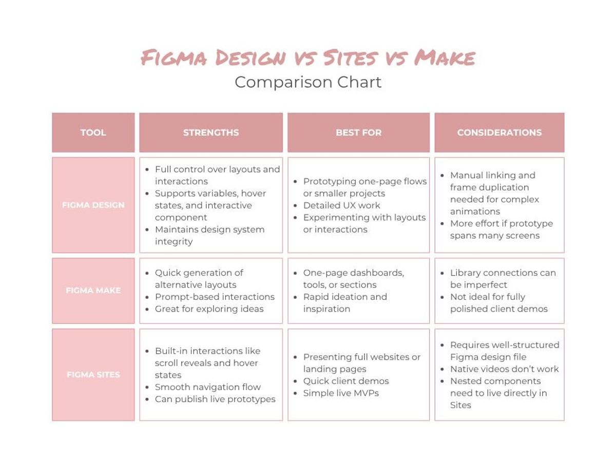
Prototyping in Figma: Design vs Make vs Sites
When you’re designing a website, dashboard, or any multi-page project, showing clients static screens can only get you so far. It’s one thing to see how a page looks, but it’s completely different to experience how it actually works — the navigation, the hover effects, and the animations that bring the interface to life. That’s where prototyping comes in.
For a recent client project, I needed a prototype that worked on desktop and mobile, with scroll-reveal animations, hover states, and realistic navigation. Once I had all the pages, components, and styles set up in Figma Design, I started thinking about the best way to bring it all to life.
There were a few ways to tackle it. I could stick with Figma Design, which I know well but which gets tedious for multi-page prototypes. I could try Figma Make, which is new, evolving constantly, and lets you prompt interactions instead of building everything manually. Or I could use Figma Sites, which has ready-to-use interactions like scroll reveals, and handles multi-page flow more smoothly.
In this article, I’m comparing Figma Design, Figma Make, and Figma Sites based on my experience with this project. The goal is to give you a clear sense of what each tool is best for, where they shine, and how to choose the right one (or combination) for your own prototypes.
Figma Design: Precise, Familiar, but Manual
Since all my pages, components, and styles were already set up in Figma Design, it felt natural to start prototyping there. I had prototyped smaller projects in Figma Design before, and for those it usually works well. Hover effects on cards, buttons, and dropdown menus behave predictably once set up, and components can be reused across pages without rebuilding interactions. For things like the MegaMenu or clickable cards, this was a huge advantage: I could set them up once and rely on them to work consistently everywhere.
The challenge came with scroll-triggered animations. I wanted text and images to slide in from the bottom as you scroll, giving the prototype a more dynamic, realistic feel. Figma Design doesn’t have a built-in way to do this, so to achieve it, it would need duplicated frames — one with the element out of view, one in place, and an animation between the two. Doing this for one section is manageable, but across six or seven pages, each with multiple sections and reveal effects, it quickly becomes unfeasible. Knowing this upfront, I realized building the entire multi-page prototype in Design would take far too long.
Despite this, Figma Design has clear advantages. For one-page prototypes, smaller projects, or flows where interactions mostly stay inside components, it’s precise and reliable. You retain control over timing, positioning, and layout, and components behave exactly as expected. Basic hover effects, buttons, and reusable patterns work without friction. But once you move to multi-page prototypes with complex, scroll-based animations, the manual effort grows quickly. That’s when it makes sense to consider other tools like Figma Sites or Make to save time and reduce repetitive setup.
Figma Make: Quick for Ideas, Tricky for Multi-Page Prototypes
I’ve used Figma Make before, mostly for inspiration or trying alternative layout ideas, so I wanted to see if it could help speed up prototyping for this project. You can copy frames from Figma and connect them to your library with components, variables, and styles, which initially seemed promising.
At first, I tried copying whole pages into Make, but it quickly became messy. Headings and styles from the library weren’t applied correctly, and interactions didn’t carry over as expected. I had to fix many things manually or use prompts to correct them.
I switched to copying the page section by section, prompting interactions along the way. This worked better, but still involved a lot of back-and-forth. Hover effects had to be described again because they weren’t automatically taken from the components. Doing this for multiple pages would have been overwhelming.
Overall, it felt like there is still a disconnect between the Figma Design and Figma Make. Even with libraries connected and frames copied over, something was missing in the workflow, which meant more manual adjustments than I had hoped for.
That being said, Figma Make might simply not be intended for this type of use case and it’s also still evolving. It still works really well for smaller sections, experimenting with layouts, or generating ideas quickly, so it can be a useful part of your toolkit, just not the fastest path for multi-page client prototypes like this one.
Figma Sites: Realistic Flow, but Still Some Gaps
After struggling to get a full multi-page prototype working smoothly in Figma Make, I moved to Figma Sites. Its built-in features, like scroll-triggered reveals, hover states, and multi-page navigation, promise a smoother way to showcase full websites without duplicating frames or manually linking every interaction. In theory, it’s meant to save time and let you focus on presenting the design rather than building each animation from scratch.
In practice, Figma Sites largely delivers on that promise, but only if your Figma Design file is set up correctly. Auto-layout should be applied consistently, components and variants organized, and variables configured for responsive behavior such as adjusting font sizes on mobile. Linked through a shared library, all of this allows styles, components, and interactions to work reliably across multiple pages. When the foundation is solid, creating a realistic, scrollable, multi-page prototype feels surprisingly fast and polished.
There are still a few caveats though. For example, native videos, like video layers used as backgrounds, don’t work in Figma Sites. In my project, a video-based hero animation that worked perfectly in Figma Design didn’t carry over. This means that any video content will need a workaround, like embedding through YouTube. Also in some cases, i found it to be more reliable to place certain components directly in the Sites file rather than relying solely on the shared library, especially for interactive elements that appear on every page — I’ve gone into this in more detail in my previous article.
Overall, Figma Sites works great when you want to show a multi‑page website realistically and efficiently. Beyond just prototyping, it also allows you to quickly publish a live site, using templates or section blocks if that fits your project. So when your goal is to deliver a client-ready prototype that actually feels like a finished site, or even to launch a simpler live version directly from Figma, Sites offers a smooth balance of speed, interactivity, and polish.
A Practical Hybrid Workflow
To get the most out of all three tools, I settled on a hybrid workflow that leveraged each tool where it shines. Each step has a clear role, letting me preserve design consistency, explore ideas, and ultimately deliver a polished multi-page prototype.
Figma Design: The foundation
All layouts, pages, and interactive components live here. This is where I finalized auto-layout across desktop and mobile, set up variables for responsive typography and spacing, and prepared components with hover states and variants. By building the system properly in Design, everything behaves predictably and can be reused across the prototype.
Figma Make: Optional ideation
I used Make selectively to explore alternative layouts, generate motion ideas for certain sections, or quickly mock up interactions for single-page flows. Instead of building full pages here, it became a tool for testing concepts in isolation and feeding inspiration back into Design without disrupting the system.
Figma Sites: Assembling the prototype
Once the pages and components were ready, I brought everything into Sites. Here, I could set up scroll-triggered reveals, hover interactions, and multi-page navigation without duplicating frames or manually linking every interaction. The workflow allowed me to focus on the experience and presentation, and I could even publish the prototype live to share with clients.
Final Thoughts
Figma’s ecosystem keeps evolving, and the lines between Design, Make, and Sites are blurring more every month. Still, each tool has its sweet spot, and understanding their differences makes a huge difference when building prototypes.
For projects like this, a hybrid workflow works best. Use Figma Design to nail your components, variants, and variables, and make sure everything behaves consistently. Turn to Figma Make when you want to experiment with layouts or generate interactions quickly. Then bring key components into Figma Sites to create a polished, interactive prototype that feels like a real website, or even a live page if needed.
By combining tools thoughtfully, you can save time, keep your design system intact, and give clients a prototype that actually communicates the experience, not just the visuals. The tools aren’t perfect, but knowing when and how to use each one makes prototyping faster, smoother, and more effective.