Your proposal is the first thing a client sees you make. Most agencies waste it.
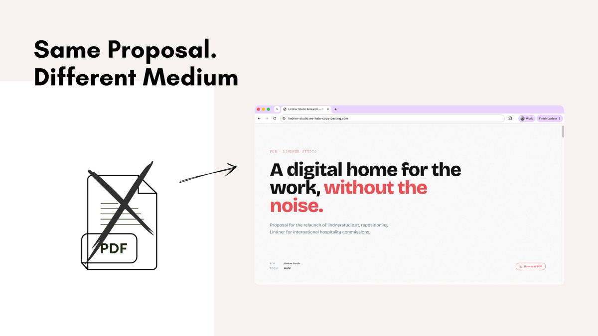
Picture the usual proposal. A PDF or slide deck lands in an inbox, often beautifully designed, with considered typography and a polished cover. The client opens it alone and reads it front to back, or more likely skims it, trying to work out what actually matters across twenty pages of process, timelines and pricing.
By that point they've probably already seen your website, looked through your work and maybe had a call with you. All of that builds trust. None of it is something you've actually made for them.
The proposal is the first thing you deliver.
It's also usually sitting next to three or four other proposals from other agencies, all trying to make the same case. That alone makes it worth thinking about differently.
The obvious answer, once you see it
If you're pitching a website, there's a simple question underneath all of this: what's actually the best way to convince someone you can build a great website?
A PDF answers that with words. Case studies answer it with projects you've already done. Both are useful, but they're still indirect. One describes what you'll do. The other proves what you've done before.
Neither shows what it's actually like to experience something you've built today.
Once that clicked for me, the direction felt surprisingly obvious. Instead of treating the proposal as a document, treat it as a small website. Not a concept for the client's future homepage, but a real page built with the same level of care you'd bring to the actual project. It just happens to contain the proposal.
If your pitch is that you build thoughtful digital experiences, the proposal can already be one.
Everything else in this post is really just what that idea looks like in practice.
A page isn't just a document that scrolls
The first instinct is usually to take the PDF and publish it online. Twenty pages become one long page and suddenly it's a "web proposal".
I don't think that's actually much of a change.
It's still organised like a document because that's what it started as. The cover is still there. The table of contents is still there. The sections still follow the same logic. You've changed the container, but not the way it thinks.
A browser simply has different constraints than paper.
Once I started looking at each section through that lens, a lot of things that had always felt fixed suddenly became optional. The cover disappeared because there was nothing left to introduce. The table of contents no longer solved a problem anyone had. Three strategy options no longer needed three separate pages because they could sit next to each other and be compared directly.
Some sections survived almost unchanged. Others disappeared entirely. Most were rewritten, not because the content itself was wrong, but because it had originally been shaped around the limitations of a document.
The useful question became: if this proposal had never been a PDF in the first place, would I design this section the same way?
Quite often, the answer was no.
Things a browser is genuinely better at
A lot of people hear "web proposal" and immediately think animations.
That wasn't really where the value came from.
Interaction turned out to be much more useful. Instead of reading three different project approaches in sequence and trying to remember the first one by the time you reach the third, you can switch between them instantly. The comparison happens naturally because the page changes with you.
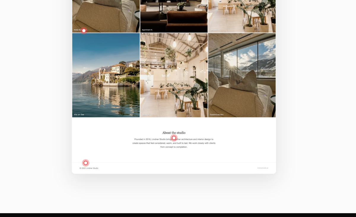
The same thing applies when talking about the client's existing website. Most proposals include a few paragraphs explaining what's working and what isn't. On a webpage those observations can sit right next to the actual site. Hover over one point in the explanation and highlight the exact part of the navigation you're referring to. It's a small interaction, but it removes a surprising amount of mental effort from the reader.
Responsiveness is another example. Agencies often promise they'll build a website that works beautifully on mobile. A webpage doesn't need to promise anything. Open it on your phone and you've already demonstrated the standard you're aiming for.
None of these interactions are particularly complicated. They're simply things a browser is good at that a document will never be able to do.
Having more freedom doesn't make the design easier
One thing I didn't expect was that moving away from a fixed page creates a completely different design problem.
With a PDF there's an inherent sense of restraint. Every page has the same dimensions and eventually you run out of room. Browsers don't give you that boundary. Every section could become larger. Every heading could become more dramatic. Every transition could become animated.
Very quickly the challenge stopped being what I could add and became what was actually worth adding.
Most sections stayed fairly quiet because they were already doing their job. The vision section ended up becoming more immersive because it benefited from a slower pace. The timeline gradually reveals itself because movement helps explain progression. Beyond that, I tried to leave things alone.
I found that a useful rule was to ask whether a section was taking advantage of the medium or simply decorating itself. If removing an interaction didn't change the way the section was understood, it probably didn't need to be there in the first place.
There are still reasons to keep the PDF
A webpage has one obvious advantage: you can update it after you've sent it. If you notice a typo or want to clarify something after a meeting, everyone automatically sees the latest version.
That flexibility is also a downside.
Some clients genuinely want a proposal that's fixed. Something they can forward internally or come back to a month later knowing it hasn't quietly changed underneath them.
I don't think those expectations are incompatible. The webpage is the primary experience, but every proposal can still be downloaded as a PDF. You can also keep proposal pages behind a simple password. It's a small detail, but I like that it makes the experience feel a little more private and clearly intended for one client
A proposal is already part of the work
This whole experiment started after building a Claude skill that takes a brief and assembles it into a proposal automatically. That made putting a proposal together much faster, but it also made something else much more obvious. Once assembling the content stopped being the bottleneck, the format became the interesting part.
Building a proposal like this used to take real time, enough that doing it for every pitch never made sense. That's changed. What used to take days, now takes an afternoon.
I don't think this is really about proposals.
It's about recognising that every interaction with a potential client communicates something about how you work. Agencies spend a lot of time talking about craftsmanship, attention to detail and thoughtful digital experiences. Then the first thing they actually deliver is a static attachment that could have been sent by almost anyone.
The proposal is already part of the product. It might as well feel like it.