How to Teach Your AI Agent Taste
Taste is what separates a designer from AI. You'll find that claim everywhere right now, in threads, in talks, in every post about what AI still can't do.
I think that's true. AI can't tell you why one hero section works and another one doesn't. It has no history of looking at things, no opinions it earned on its own.
But what is taste, actually. And is there any way to teach it to AI, so you can actually use it in your projects, other than just listing references and describing what you want.
What taste actually is
Taste is judgment, and judgment comes from two places.
Part of it is innate. Some people just notice things others don't, a color that's slightly off, a headline trying too hard, a layout that feels crowded before you can say why.
Part of it is built, over years of looking at things, noticing what works, forming preferences, changing your mind, forming them again.
That mix is why two designers who've looked at the exact same thousand websites still land on different taste. The exposure is shared. The judgment isn't.
AI has neither. No innate eye, and no years of looking at anything personally, just an average of what everyone else has made. That's the actual reason AI output tends to converge on the same look, the same gradients, the same rounded cards, the same safe layout every time. AI slop is just the visible result of no judgment doing the selecting. The models aren't bad. Average is what's left when nothing filters it.
How designers already do this
The innate part of taste isn't something you can build on purpose. But the exposure part is, and designers already have a way of doing it. You browse, Behance, Awwwards, Godly, Mobbin, whatever your rotation is. Some people collect what they find, screenshots dropped into a Figma file, links saved somewhere. Most just look and move on, and that still counts, taste builds from exposure whether or not you're archiving it.
Then a project starts, and you shift modes. Now you're looking for something specific, what fits this client, this industry, this tone. You gather a handful of references and hand them to your AI agent along with the brief.
None of this actually gets your taste into AI in a form it can use well.
The casual browsing never reaches it at all. Scrolling Behance and Awwwards makes you better at noticing things, but that stays in your head. It only turns into something AI sees once a project forces you to go looking on purpose.
The scattered saving gets AI access, but not understanding. Even with something like a Figma MCP, an AI agent can technically read what you saved. But it's just images sitting next to each other, no record of why you saved it, what it's good for, what it would or wouldn't fit. AI can see the file. It still can't see your reasoning.
And the per-project gathering, the part that actually works, still runs into a limit. A couple of screenshots without structure tends to make AI lean on the closest one and clone it, rather than blend what it's seeing into a pattern of its own.
What I wanted was somewhere for the browsing to actually go, and enough of it in one place that AI could work from the pattern instead of the screenshot.
I don't think you can actually replicate taste. Part of it is innate, and that part isn't going anywhere, no tool copies that. But the developed part, the years of looking at things and forming opinions about them, that part lives somewhere. Mostly in my head, half-remembered, hard to explain on demand. What I could do is take what's in my head and put it somewhere structured instead, classified, searchable, always there to pull from when it's needed.
So I built a taste library
A few years ago that would've meant hiring a developer, or making do with whatever tool someone else built for a different purpose. It doesn't anymore. I'm a designer, not a developer, and I built this myself, in an afternoon, by describing what I wanted to Claude Code.
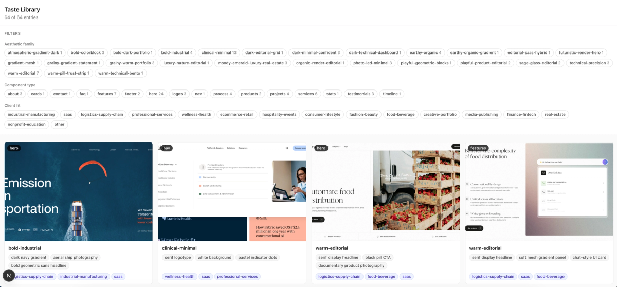
Nothing fancy. No database, no login, nothing running anywhere but my own machine. Just a small Next.js app that reads one JSON file and shows me a grid of everything I've saved, filterable by what kind of thing it is and what it's good for.
Every entry has the same shape. A screenshot, what component it is, hero, footer, pricing, whatever. An aesthetic family, which I don't assign upfront, it only gets a name once two or three images actually cluster around the same visual language. A set of keywords, the literal things in the image, halftone texture, serif type, pastel color blocks. A separate set of mood words, how it feels rather than what's in it, quiet, confident, warm. And which industries it would or wouldn't fit, so I'm not pulling a playful mascot brand into a fintech pitch.
That last field matters more than it sounds. Taste isn't just "I like this," it's "I like this, for this."
If you want to build your own version, here's roughly the prompt I used to get Claude Code to scaffold it:
CREATE A "TASTE LIBRARY" APP
Goal: a personal, local design inspiration library. Static data for now, expandable to
automated ingestion later. Solo project, no auth, no database, runs on localhost only.
STACK
Next.js (App Router), TypeScript, Tailwind CSS. No backend, no database, no external API calls.
DATA
All data lives in a single static file: /data/entries.json, an array of objects shaped like this:
{
"id": "string, unique slug",
"image": "/images/filename.png",
"componentType": "a string like 'hero', 'pricing', 'nav', 'testimonial', 'footer'",
"aestheticFamily": "freeform string, e.g. a short name I give the style, this is NOT a fixed list, it should emerge organically as I tag more entries",
"keywords": ["array of freeform strings describing literal visual/technical elements: textures, colors, type treatment, layout patterns"],
"moodWords": ["array of freeform strings describing emotional/tonal feel: e.g. quiet, technical, playful, trustworthy — how it feels, not what's literally in it"],
"clientFit": ["array of values from the fixed industry list below — industries this style would suit"],
"avoidFor": ["array of values from the same fixed industry list — industries this style would NOT suit"],
"brief": "a one paragraph description of the aesthetic, tone, and what makes it distinct, written so it can be pasted directly into a future AI build prompt"
}
Fixed industry list (used only for clientFit and avoidFor, nothing else):
["industrial-manufacturing", "saas", "logistics-supply-chain", "professional-services",
"wellness-health", "ecommerce-retail", "hospitality-events", "consumer-lifestyle",
"fashion-beauty", "food-beverage", "creative-portfolio", "media-publishing",
"finance-fintech", "real-estate", "nonprofit-education", "other"]
This list is meant to be broad, not exhaustive. It can be manually extended later by editing
the JSON directly if something doesn't fit; do not force entries into "other" as a first resort.
Actual images live in /public/images and are referenced by path in entries.json. I will add
images and their corresponding JSON entries manually for now, there is no upload flow needed.
FEATURES
1. Grid view (home page)
- Responsive card grid, one card per entry
- Each card shows the screenshot, aestheticFamily as a label, 2-3 keywords, and clientFit tags
- Filter bar: filter by aestheticFamily (dynamically generated from whatever values exist in
entries.json, with a count per family) AND a separate filter by clientFit (from the fixed
industry list), combinable so I can filter by both at once
- Show componentType as a small badge on each card
2. Detail view (click a card, or expand inline, whichever is simpler to build well)
- Full size image
- aestheticFamily, keywords, moodWords, clientFit, avoidFor all shown clearly as tags/labels
- brief as plain text with a "copy" button
3. No auth, no API routes, no database. Read entries.json at build time or via a simple
fetch/import, whichever is more idiomatic for App Router with static local data.
DESIGN
Clean, minimal, dark or light is your call, but keep it fast and unopinionated since this is a
utility tool for me to browse my own taste, not a client-facing product. Favor clarity and
information density over decoration.
FUTURE PROOFING (do not build now, just do not architect against it)
Eventually I may add a script that calls an AI API to auto-generate these fields from a new
screenshot and append the result to entries.json. Nothing about today's build should make that
harder later, but do not build the script or any upload UI now.
FIRST STEP
Scaffold the app with 2-3 clearly generic placeholder entries in entries.json (label them
"Placeholder A", "Placeholder B" etc., do not invent realistic-sounding aesthetic names or
keywords for them) so I can confirm the grid, filter, and detail view work before I start
adding my own real screenshots and entries.
I feed it screenshots in batches, ask Claude to tag them against this shape, and paste the results in. Slow, on purpose. It forces me to actually look at each one.
It won't be perfect on the first pass. You'll use it for a while and notice things that don't fit how you actually work, then adjust. That's just normal for a tool like this.
Right now it's intentionally simple, and intentionally manual. I screenshot a section from a site I like, drop it into a folder, and ask Claude Code to look at it and classify it, what it is, what family it belongs to, what industry it'd suit, what mood it carries. No upload flow, no automated pipeline, no database. Just a folder and a JSON file.
And that's enough right now. Of course, it could become a fully automated drop-and-tag tool later, but it doesn't need to be that yet to be useful.
Okay, but how do you actually fit this into your workflow
That was my next question too, once it was built. The library lives on its own, outside any project. Which means every time I wanted Claude to actually use it, I'd have to point to the path myself, tell it where to look, ask it to check. Every single time, in every new project.
That's exactly the kind of thing that should be a skill instead of a habit I have to remember. So I built one, a small global skill for Claude Code that checks the taste library automatically whenever I'm designing or building something new, in code or in Figma, not just when I explicitly ask.
Also here, the first version wasn't ideal. It would find the single closest match in the library and basically clone it, same layout, same structure, just reworded. Technically on-brand, but not actually what I wanted. I didn't build this so Claude could copy one screenshot, I wanted it to have a sense of my taste, the same way a person who's looked at a hundred of my references would.
So the skill now looks more like this:
- Filter the library by what's relevant, componentType, industry, mood, whatever signals the task gives.
- Pull several matching entries, not just the closest one, ideally spanning more than one aesthetic direction if more than one genuinely fits.
- Look across what's pulled for the pattern, not any single entry. Recurring type choices, recurring palette instincts, recurring layout habits.
- Use that pattern to inform the actual design decision, don't reproduce any one entry's specific layout or composition.
- Say which directions informed the output, not which single reference it copied, so I can redirect if it leaned the wrong way.
- If nothing in the library fits, say so, and just use normal design judgment.
That fifth point matters in practice. It'll say something like drawing on the warm, editorial entries for tone, restrained type, a warm neutral palette, instead of just naming one file. I can tell immediately whether it's actually picked up on my taste or just found something close enough.
That default is synthesis, not a rule against ever using one entry directly. Sometimes one layout in the library is just the right one for what I'm building. If I already know that, I'll point Claude straight at that specific entry and tell it to use it as the actual reference. The skill only kicks in to blend across several when I haven't picked one myself.
What it actually looks like
After building the library, uploading a batch of references, and getting the skill working, it was time to put it to the test. I used a simple prompt, once with the skill on, once without.
Design a features section for a healthcare scheduling app.
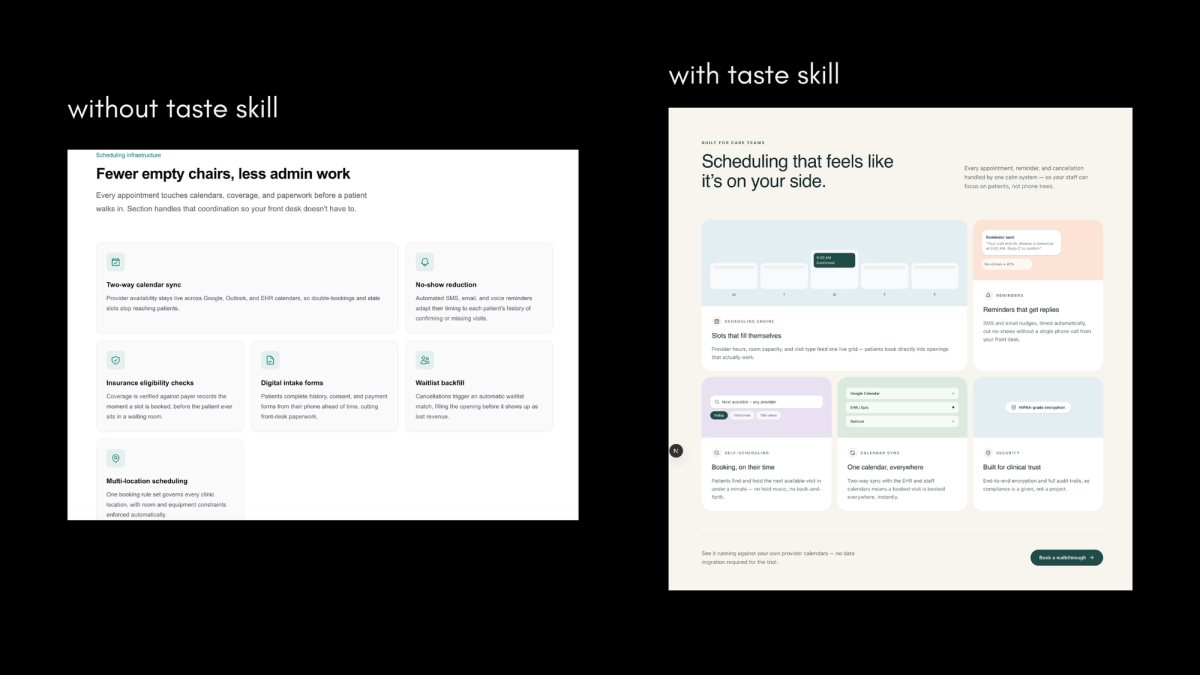
The structure is nearly identical in both. That's expected, a features section is very often a grid of cards no matter who or what designs it. Look at what's different instead. The palette. The warmth. The way categories are labeled. The type treatment.
That's taste, and it's the part that's actually mine.
What comes next
None of this replaces the actual research. I still go looking for references for a specific client the same way I always did. The only real change is the habit underneath it, when I see something I like, on a project or just scrolling, it goes into the library instead of disappearing. So I am not doing more work, I am just not losing the work I was already doing.
Right now I am still manually uploading screenshots and asking Claude to tag them, one batch at a time. The obvious next step is automating that part fully, an actual pipeline instead of a manual back and forth, and maybe not staying on localhost either. Something closer to a real tool than a personal script.