How to Build a Custom Carousel in Builder.io (Without the Widget)
When I started working on a project to showcase multiple projects with images, titles, and descriptions, I naturally reached for Builder.io's carousel widget. It seemed like the obvious choice: a pre-built component that would handle navigation, transitions, and everything else I needed. But after following the installation instructions and adding the widgets to my code, something was off. When I opened the visual editor, the Accordion widget showed up perfectly fine, but the carousel simply wasn't there. I tried reinstalling, checking my imports, and restarting the dev server, but the carousel never appeared in the widgets list.
Rather than spend more time troubleshooting why one specific widget wouldn't show up, I decided to build the carousel from scratch using Builder.io's built-in state management and data bindings. It turned out to be surprisingly straightforward once I understood the right patterns, and it gave me complete control over the behavior and styling.
In this guide, I'll walk you through how I built a fully functional image carousel in Builder.io without relying on any widgets or external libraries. You'll learn how to use state management, data bindings, and actions to create an interactive component that works exactly the way you want it to.
Prerequisites
Before we start, you'll need:
- A Builder.io account with a project already integrated
- Basic familiarity with Builder.io's visual editor
- A data model set up for your content (we'll cover this in the next section)
If you're new to data bindings in Builder.io, I have another article that goes deeper into that topic. For this guide, we'll keep things practical and focus on getting the carousel working.
Step 1: Setting Up Your Data Model
The first thing you need is a data model to hold your project information. In Builder.io, data models let you create structured content that you can query and display in your components.
Here's how to set one up:
- Go to your Builder.io dashboard
- Navigate to Content Models in the sidebar
- Click + New Model
- Name it "Projects" (or whatever makes sense for your content)
- Add the following fields:
- projectImage (type: File)
- projectTitle (type: Text)
- projectDescription (type: Long Text)
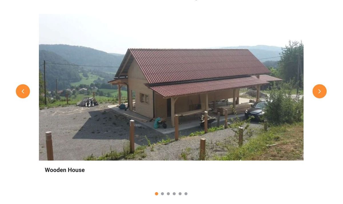
Once you've created the model, add a few entries with actual project images, titles, and descriptions. This will give you real content to work with as you build the carousel.
Step 2: Building the Carousel Structure
With your data ready, it's time to build the visual structure. The carousel needs four main parts:
- A container that holds everything
- An area to display the current slide (image, title, description)
- Previous and next navigation buttons
- Dot indicators to show which slide is active
In Builder.io's visual editor, start by adding a Box element. This will be your main carousel container. Give it some basic styling, maybe a max-width, some padding, and center it on the page.
Inside this container, add another Box that will act as a wrapper for the entire carousel content. Inside this wrapper, you'll need:
- A Button element (Previous/left arrow)
- A Box for the slide content
- A Button element (Next/right arrow)
Inside the slide content box, add:
- An Image element
- A Text element for the title
- Another Text element for the description
Style the wrapper with flexbox to arrange the previous button, slide content, and next button horizontally. I used display flex with space-between to keep the navigation buttons on the edges.
Below the wrapper, add another Box for the dot indicators. Inside this box, you'll add one dot/button element. Don't add more than one yet, the repeater will handle that automatically. We'll come back to this in Step 4.
At this point, your structure should look something like this:
This structure seemed logical to me from the start, and it worked well. The key is keeping things organized. Ideally, each part of the carousel has its own container, making it easier to style and manage.
Step 3: Connecting Data and Binding Elements
Now we need to pull in the project data and bind it to the slide elements. To do so, go to the Connect Data section in the Data tab and:
- Click + Connect Data
- Select your Projects model from the dropdown
- Set Filter data by to Query
- This will create a binding that queries all your projects
Note: The Connect Data section is only available in Builder’s Classic UI, not in the Modern UI, so you will need to switch to the Classic UI in the settings.
With the data connected, the next step is to bind the elements for the current slide. Select your Image element in the slide content area. Go to the Data tab and look for the Element data bindings section. Click + New Binding:
- Get:
image - from:
state.projects.results[state.currentSlide]?.data?.projectImage
Do the same for the title and description but using Get: Text:
Title binding:
state.projects.results[state.currentSlide]?.data?.projectTitle
Description binding:
state.projects.results[state.currentSlide]?.data?.projectDescription
The ?. syntax (optional chaining) prevents errors if the data isn't loaded yet. The exact path to your data might be slightly different depending on how your model is structured. Check the State Inspector to see the exact nesting.
At this point, you should see the first project displayed. The image, title, and description should all be visible. If nothing shows up, expand the State Inspector and verify the exact path to your data.
Step 4: State Management and Interactivity
Now that your slide elements are bound to state.currentSlide in Step 3, we can use that state to control which slide is visible and handle navigation.
Set the Current Slide
- Select your Carousel Container and go to the Content State section in the Data tab.
- You should see a field called currentSlide.
- Enter 0 as the value so the carousel starts on the first slide.
This state is the same one used in the bindings for your image, title, and description. Changing currentSlide automatically updates the content displayed in your slide elements.
Previous and Next buttons
Select your Previous button, go to the Element events section in the Data tab, and add a new event:
- Trigger:
onClick - Action: Run Code
- Code:
state.currentSlide = state.currentSlide === 0
? state.projects.results.length - 1
: state.currentSlide - 1;
This code checks if you're on the first slide (0). If you are, clicking Previous takes you to the last slide. Otherwise, it just decrements the slide number by 1.
For the Next button, do the same thing but with different code:
- Trigger:
onClick - Action: Run Code
- Code:
state.currentSlide = (state.currentSlide + 1) % state.projects.results.length;
This increments the slide number, and when you reach the end, it wraps back to 0.
I initially tried using the Set State action instead of Run Code, but Set State only accepts simple values like text or numbers. For logic like "go to the next slide unless you're at the end, then go to the beginning," you need Run Code.
Dot indicators with the repeater
Now for the dot indicators. Select your button (dot) element and bind it to your projects:
- Repeat for each:
state.projects.results
Then add an onClick action:
- Trigger:
onClick - Action: Run Code
- Code:
state.currentSlide = state.$index;
The $index variable is automatically available inside repeaters, it represents the current item's position (0, 1, 2, etc.). When you click a dot, it sets currentSlide to that dot's index, jumping directly to that slide.
Step 5: Styling Active States
The last piece is making it clear which slide is currently active by highlighting the corresponding dot.
Select the dot button inside your repeater and go to the Styles tab. Find the Background color setting and click the binding icon next to it.
Add this binding:
state.currentSlide === state.$index ? '#0066CC' : '#CCCCCC'
This checks if the current slide matches this button's index. If it does, make it blue (#0066CC). If not, make it gray (#CCCCCC). Change the colors to whatever matches your design.
I tried a few different approaches for this styling. At first, I tried binding style.backgroundColor in the Data tab, which technically works but felt less intuitive. Then I tried using CSS classes with conditional bindings, which is more flexible if you need complex styling. But for a simple color change, binding the background directly in the Styles tab was the cleanest solution.
You can also add a transition to make the color change smooth:
- In Styles → Advanced → Custom CSS, add:
css
transition: all 0.3s ease;
If you want to add smooth sliding animations when changing slides, you can apply CSS transforms to your content display area. That's optional, but it does make the carousel feel more polished.
Common Pitfalls I Encountered
Building this carousel taught me a few things about Builder.io that weren't immediately obvious:
Data structure nesting: Always check the State Inspector to see the exact structure of your data. I wasted time trying to bind to state.projects[0] when the data was actually at state.projects.results[0]. Expanding the inspector and seeing the actual structure saved a lot of frustration.
Run Code vs Set State: For any logic beyond simple value assignment, you need Run Code. Set State works for things like "set currentSlide to 2," but not for "increment currentSlide by 1 unless it's at the end, then reset to 0."
Bindings not updating: If your bindings aren't responding to state changes, make sure the state is defined on the correct element (usually the parent container) and that you're referencing it correctly in child elements.
Final Thoughts
Building a custom carousel in Builder.io turned out to be more straightforward than I expected once I understood the right patterns. The carousel widget would have been faster if it worked, but building from scratch gave me much more control and taught me how Builder.io's state management and data bindings really work.
This approach isn't just useful for carousels. The same patterns (state management, data bindings, repeaters, and conditional styling) apply to all sorts of interactive components. Tabs, accordions, image galleries, filterable list, they all follow similar logic.
If you're running into issues with Builder.io widgets or just want more control over your components, I'd recommend trying the custom approach. Yes, it requires understanding state and bindings, but once you get those concepts, you can build almost any interactive component you need without relying on pre-built widgets or external libraries.
The tools are there in Builder.io. Sometimes you just need to use them directly instead of waiting for a widget to be ready.