Google Stitch's Vibe Design Update: Exciting for the Right Reasons, Just Not Yet
Last week Google announced a major update to Stitch, their AI-native design tool, introducing what they are calling vibe design. Within hours the YouTube thumbnails were already up. "Designers are cooked." "Figma is dead." Figma's stock actually did drop, which did not help. It happens every time a new AI tool launches, and honestly it is getting a little tired.
But I was genuinely excited to try it. I had used Stitch before but was never really convinced by the results. This update felt like it might be different. And I am always looking for ways AI can actually assist designers in doing better work, not replace them. So I opened it again and spent some time testing it properly. This is what I found, what worked, what didn't, and what I actually think about where this is all heading.
The Stitch update, explained
So what actually changed with this update. Stitch has been around since Google I/O 2025 but this March 2026 release is the one that got everyone talking. Google gave it a complete redesign and introduced what they are calling vibe design, the idea that you start a design not from a wireframe but from a feeling, a business objective, or something that is currently inspiring you.
The update brought a few things worth knowing about. The canvas was completely redesigned into an infinite workspace where everything lives in one place, from early ideas to working prototypes. There is a new design agent that reasons across your whole project, and an agent manager that lets you explore multiple directions in parallel. You can now generate variations from a single design, connect screens into clickable prototypes, and use voice input to make changes and get critiques as you speak. There is also DESIGN.md, a markdown file that lets you bring your own design rules into the process, and a direct export pipeline into developer tools via MCP.
Google says it is for two very different people: professional designers who want to explore dozens of directions quickly, and founders or non-designers bringing a product idea to life for the first time. Worth keeping in mind as we get into the actual experience.
Putting it to the test
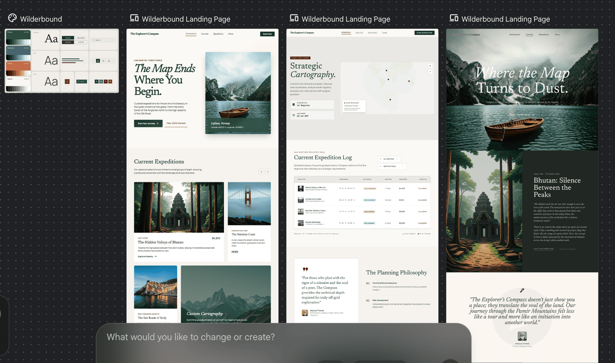
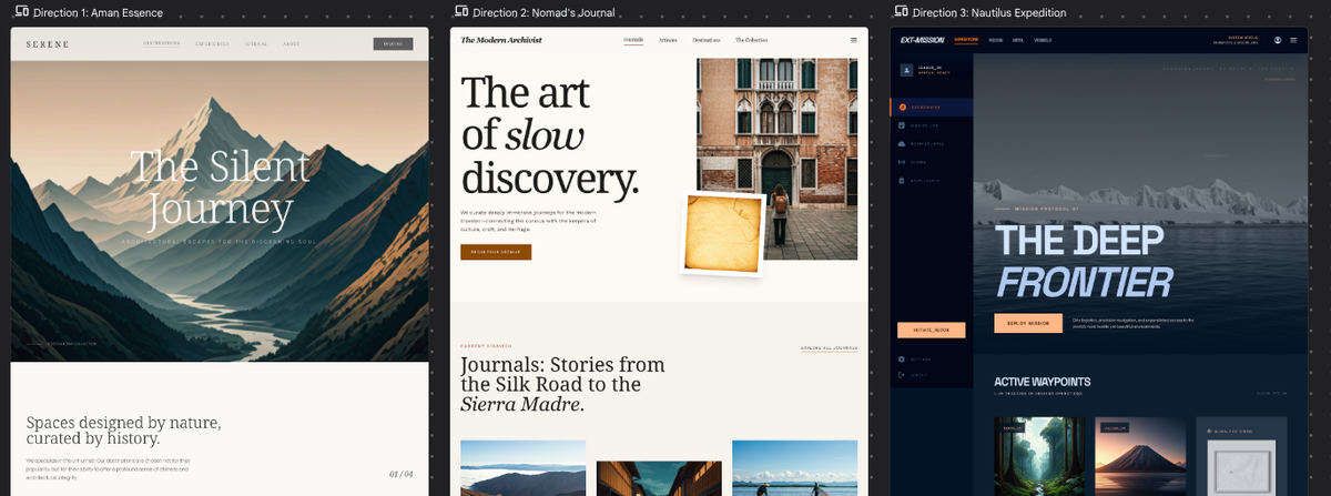
So I opened it and started with something that felt like a good test case: a boutique travel agency specializing in off-the-beaten-path destinations. Kept the prompt deliberately open. That is kind of the whole point of vibe design. Start with a feeling, not a wireframe. Here is what it created.
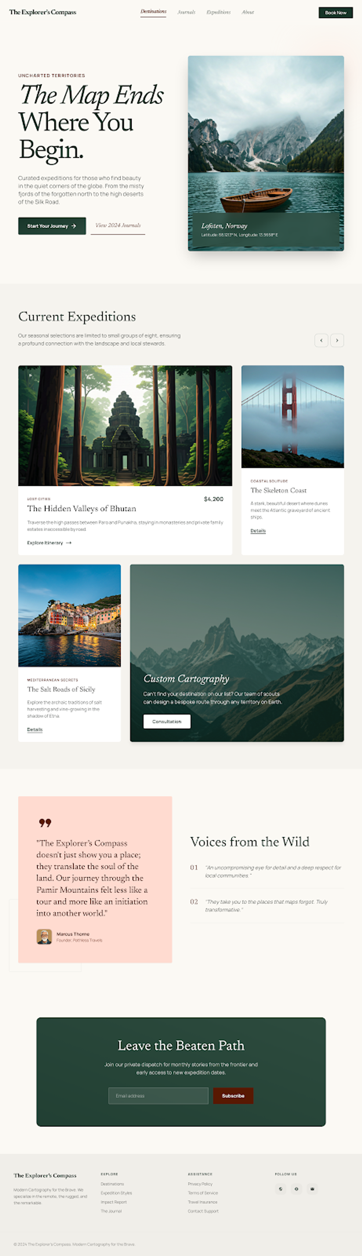
One thing I liked right away: alongside the UI it generates a design system. Color palette, typography, component styles, all laid out visually on the canvas. Small detail but a thoughtful one. You have something to react to immediately rather than staring at a blank screen, and it sets a collaborative tone from the start.
And honestly the first output was not bad. Nothing that made me think oh wow, but it had a clear layout, decent structure, and you could see it had understood the brief. Encouraging start.
Then I tried clicking into one of the screens to edit it and everything below the hero just vanished. Just the top section left. Tried again, same thing. Later I tried on a different generation and the bug was not there, I could actually edit. You can change text directly, and for other elements you select them and tell the agent what to change rather than clicking in like you would in Figma. Different mental model but it makes sense once you get used to it. Still, you are working through the agent for every change, which adds a layer between you and the design.
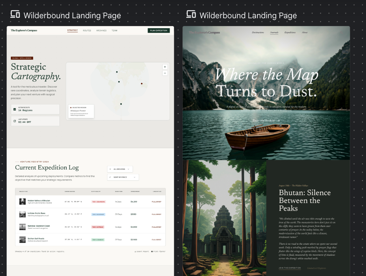
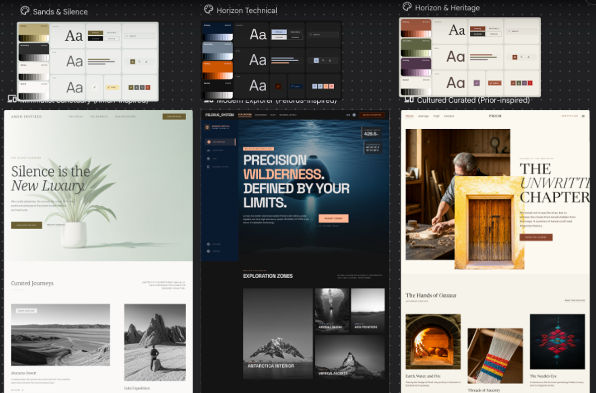
I also tried the variation feature, which is one of the things I was most curious about. You take a generated design and ask Stitch to create different directions from it. The idea is genuinely useful, quick exploration without starting from scratch each time. But the results were hit and miss. One variation had a beautiful full-bleed hero and a real editorial quality to it. Another looked more like a data intelligence platform than a travel site. Same brief, completely different levels of coherence.
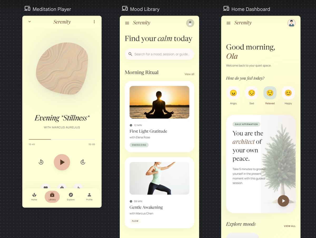
I also tested it on a completely different category to see if the same patterns showed up. I tried a meditation app and shared a Dribbble screenshot as a visual reference to give it a clearer direction. Again wasn't bad at first glance. It picked up the visual style from the reference and ran with it. But looking closer the inconsistencies were there. Three screens, same general aesthetic, but the navbar was different in each one. One screen used italic type, another didn't. The kind of mistakes that tell you the AI is pattern matching rather than actually designing with intention. A junior designer would not make those mistakes because they understand that consistency is not optional. It is what makes something feel designed rather than generated.
I was curious how far I could push it. What if instead of just describing the brief, I asked it to do some research first, look at who the category leaders in luxury boutique travel actually are, understand what makes each of them visually distinct, and then generate three directions from that. Give it some real context to reason from.
Gemini 3.0 was the default so that ran first. And the results were pretty rough. One direction had a generic mountain hero with white text on top, giving off default-theme vibes. Another had a hamburger menu and a full navigation bar sitting right next to each other, which is just a basic UX mistake. The third barely read as travel at all, more like a tech product, with a left sidebar that threw the whole layout off. Nothing that would make it past a real design review.
Switched to Gemini 3.1, which is supposed to reason more before generating. And you could tell. The directions were more coherent, the references actually came through, and there was a clearer sense of intention behind each one. But the junior designer mistakes were still there. The first had a plant as the hero image for a travel agency, which is just an odd choice. The second still had that sidebar problem. The third was actually the strongest, nice color tones and a real editorial feel, but the headline was cut off and again both a hamburger menu and nav items in the same bar. So close. And that kind of summed up the whole experience. You could see what it was trying to do, it just was not landing cleanly.
The jump between 3.0 and 3.1 was noticeable but not dramatic. Same prompt, similar mistakes, slightly more coherent output. Still, it shows the tool is moving in the right direction. But right now the results still need a lot of work before they are useful to an experienced designer. Which brings me to something worth thinking about.
My honest take
Look, I went in trying not to have too many expectations. But when something is hyped this much, and you are genuinely interested in what it could mean for how designers work, a little disappointment is hard to avoid.
Let's start with "vibe design" itself. It is a catchy phrase, and Google ran with it hard. But when you actually use it, it is just prompting. You describe something, the AI generates it. That is not a new workflow, that is just a text input. The name makes it sound like a design philosophy, but underneath it is the same thing every other AI generation tool is doing. Not worth the hype on its own.
What is actually interesting, and what I think gets a bit lost in all the noise, is the variation generation. You can take a single generated design and ask Stitch to create multiple variations from it. For designers that is genuinely useful. Exploring directions quickly, seeing how something holds up in different visual languages, getting unstuck. That is a real use case and not something other tools do quite like this yet. The design system integration is a nice touch too.
The problem is neither of them works well enough yet. The variations I tried were inconsistent in the same ways the original outputs were. The design system does not run deep enough to fix the fundamental quality issues. So you end up with a tool that has the right ideas but cannot quite deliver on them.
And I think that is the honest place to land. Not that Stitch is bad, not that designers should panic, but that right now the gap between what it promises and what it delivers is still pretty wide. The models will improve, the bugs will get fixed, and some of these ideas are worth watching. Just not yet.