Do Website Projects Still Need Low-Fi Wireframes?
You can generate a pretty convincing website in a few minutes now. Give an AI tool a description of your business, maybe a few references, and you get a homepage with a hero, feature sections, testimonials, calls to action, sometimes even animations. It might need some tweaking, but it already looks like a real website.
So why would you go back and spend time drawing grey boxes in Figma?
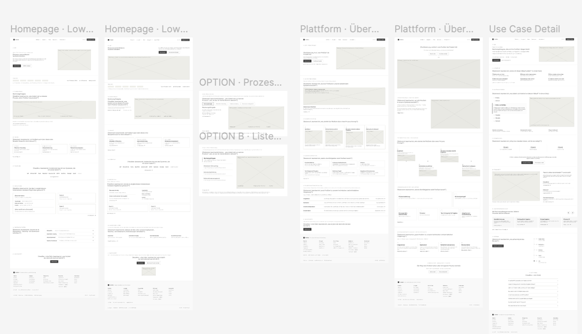
I've been thinking about this while working on a website redesign for a B2B software company. We'd already done the discovery workshop, mapped the user flows, worked out the information architecture, and identified the page types we needed. The client also had an established visual identity. I had enough to start designing, and with the tools available today, getting to something polished wouldn't have taken particularly long.
But there was still quite a lot I hadn't figured out about how those pages should actually work.
And that's where the question of low-fidelity wireframes gets interesting. Whether they still belong in a proper UX process matters less to me than whether they help us make decisions we'd otherwise be tempted to skip.
Why wireframes became part of the UX process
Low-fidelity wireframes have been a common step in UX design for a long time. The idea is fairly straightforward. Before spending hours creating detailed interfaces, you work out the basic structure. Where does the content go? How is information grouped? What is the user supposed to notice or do?
A low-fi wireframe strips the interface down to its essentials. Usually that means simple shapes, placeholder images, rough layouts and little or no visual styling.
Traditionally, one of the biggest arguments for doing this was efficiency. Moving a few rectangles around was much quicker than redesigning a fully styled page. It was also easier to explore several ideas, throw away the ones that didn't work, and get feedback before investing too much time.
That made a lot of sense when producing high-fidelity designs was considerably more time-consuming. Polish came at the end because polish was expensive.
Today, that difference is getting smaller. We have component libraries, established design systems, templates and AI tools that can produce polished layouts almost immediately. In some situations, creating a low-fi wireframe first might actually take longer than going straight into a usable design.
So speed alone isn't a convincing argument for wireframing anymore.
But speed was never the only reason to do it.
Wireframes also gave us a way to separate decisions about the structure of a page from decisions about its appearance. And that benefit hasn't disappeared just because the tools have become faster.
A sitemap doesn't tell you how a page should work
In my previous article about user flows and information architecture, I looked at how to figure out which pages a website actually needs and how visitors should move between them.
That's an important part of the process, but it doesn't answer everything.
Let's say we're designing a website for a software company. We've done the research and decided we need a homepage, product pages, use case pages, pricing, integrations and customer stories. We know which audiences we're targeting and what information they're looking for.
We might even have a pretty good idea of what belongs on each page.
But take the homepage. Should we introduce the product immediately, or start with a problem visitors will recognize? How early should we show customer proof? Do we explain the platform through one concrete example or several smaller use cases? Where does the primary call to action belong?
None of those questions are answered by drawing a sitemap.
And they're not small details either. You could take exactly the same content, arrange it in two different ways, and end up with two very different experiences.
One might help visitors understand the product and find their next step. The other might leave them scrolling through information without really knowing what matters.
This is the gap between information architecture and visual design that wireframes can help close.
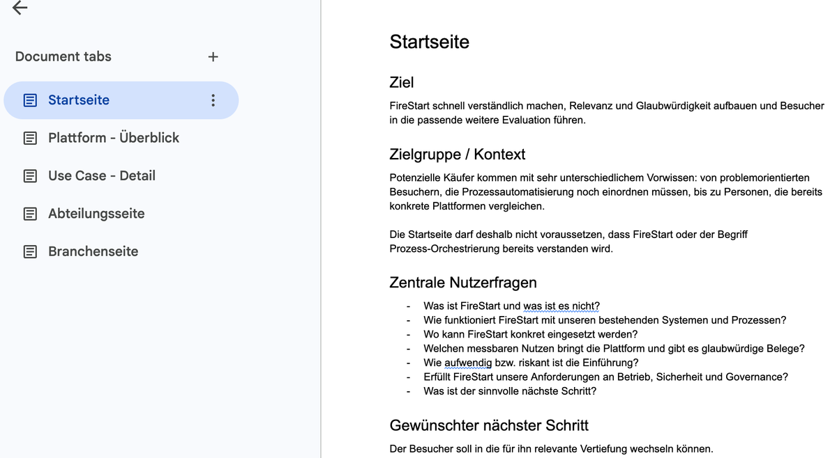
Before I start wireframing, I usually create a short brief for each page type. Nothing elaborate. Just what the page is supposed to accomplish, who's likely to arrive there, what questions they need answered, and what they should do next.
That gives me something to design against.
Because otherwise it's very easy to start arranging sections based on what looks good or what I'm used to seeing on other websites. And those aren't necessarily the right reasons for putting something on a page.
The problem with making things look finished too early
This is the strongest reason to still use low-fi wireframes.
A polished design changes how we look at a page.
Imagine showing a client two versions of the same homepage. One is a rough wireframe with grey rectangles and descriptions of what each section needs to communicate. The other has beautiful typography, brand colours, product imagery and carefully written headlines.
Even if the underlying structure is identical, the feedback you're likely to get can be very different.
With the polished version, the conversation might quickly move toward whether the colours feel right, whether the hero image is strong enough, or whether a headline needs rewriting.
Those are all valid things to discuss. Just maybe not yet.
Because what you actually need to know at this stage might be whether the product is introduced early enough, whether a section belongs on the page at all, or whether visitors get the information they need before being asked to book a demo.
The more visual detail you introduce, the more things there are to react to.
And it's not just clients. I notice it in my own work too. Once I've spent time choosing imagery, adjusting typography and making a layout feel balanced, I become more attached to it. I'm more inclined to refine what I've already designed than question whether the whole approach makes sense.
A low-fi wireframe makes that harder.
There's nothing particularly beautiful to protect. If a section doesn't belong, you remove it. If the hierarchy feels wrong, you rearrange it. If you want to try a completely different approach, you can put another version next to it without feeling like you're throwing away hours of work.
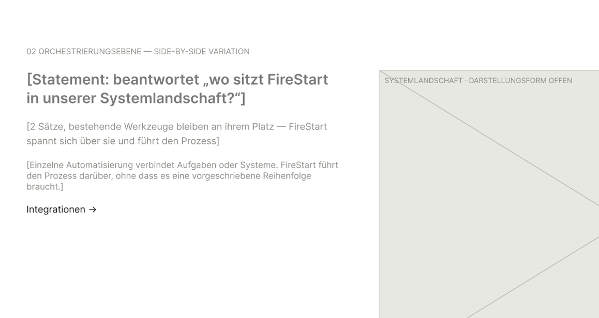
I also deliberately avoid writing finished copy at this stage. But I don't use lorem ipsum either.
Instead, I describe what a section needs to communicate. A section might say something like "Concrete process example: the current problem, what the product changes, the measurable result." Where I already know exactly what goes there, I use the real text.
That way we're discussing whether the page answers the right questions, not whether we prefer one headline over another.
Of course, you can ask clients to focus on structure when reviewing a high-fidelity design. And good designers can separate those concerns themselves. But there's a real advantage in making the material you're reviewing match the decisions you're trying to make.
A weak page can hide surprisingly well behind a beautiful design. It's much harder to hide behind grey boxes.
When low-fi wireframes actually make a difference
Not every page needs a separate low-fi stage. But in a few situations it makes a real difference.
One is when a page needs to serve several audiences or balance competing goals.
A complex B2B homepage is a good example. Someone might arrive knowing very little about the product, while another visitor is already comparing technical specifications. One needs context and explanation. The other wants to get to the details quickly.
Both need to find their way through the same website.
That's not a problem you solve simply by adding more sections. You need to decide which information to prioritise, where to offer shortcuts, and how to create a clear path without making everyone follow exactly the same journey.
Another situation is when you're developing a page template that will be used repeatedly.
Think about a use case page for a software product. If there are fifteen use cases, you probably don't want to design fifteen completely different layouts. You want a structure that works consistently while still allowing each use case to tell its own story.
But that means the initial decisions matter a lot more.
Should the page begin with the customer's problem or the solution? When should it introduce the product itself? How do you move from one specific use case to the broader value of the platform?
It's worth exploring a few alternatives before turning one of them into a reusable template.
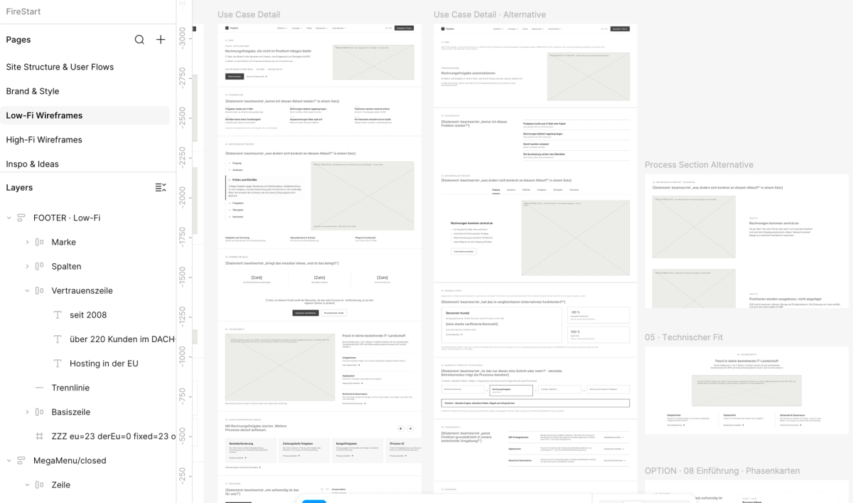
I ran into exactly this on that redesign. I had a clear brief for the use case page, but I still ended up with three low-fi variations. The beginning of the page was relatively straightforward. The difficult part was figuring out how to move from a specific process into the broader platform story without losing the visitor.
Seeing the different versions next to each other helped me work through something that hadn't been obvious from the page brief alone.
A third situation is when important requirements are still unresolved.
Maybe the pricing model is being revised. Maybe the product team hasn't decided what a new feature will include. Maybe a client knows they want a certain section but hasn't agreed internally on what it should communicate.
A rough wireframe gives you room to make those uncertainties visible. You can mark something as a hypothesis, show alternative approaches or leave a question for the next review.
A polished page, on the other hand, can make those assumptions look like decisions that have already been made.
And once something looks finished, people can start treating it as finished.
None of this means a low-fi wireframe guarantees a better website. You can still make poor decisions in grey boxes. But it creates a useful opportunity to examine those decisions before other parts of the design start competing for attention.
When I'd skip low-fi wireframes
There are also plenty of situations where a separate wireframing stage doesn't add much value.
If I'm building a simple landing page with a familiar structure, clear content and one obvious conversion goal, I might go directly into visual design. Especially if I'm working with an existing design system and components that are already established.
The same applies to standard pages such as blog articles, legal pages or a 404 page. Once the layout pattern is understood, creating another rough version doesn't necessarily teach me anything.
Even on a larger website, I wouldn't wireframe every individual page.
I usually start by mapping the page types and looking at which ones actually involve new structural decisions. A homepage might need several iterations. A product detail template might need one. A set of pages using an already agreed template might not need any.
And sometimes a content outline or quick sketch is enough to resolve the question.
One thing I'd be careful about, though, is assuming that a short page is automatically a simple one.
A campaign landing page might only have five sections, but if it's targeting an unfamiliar audience with a new offer, those five sections might require quite a lot of thought. What do visitors already know? Which objection needs to be addressed first? How much proof do they need before taking action?
A page can be short and still be complicated, because the complexity sits in the decisions behind the sections.
So the question I ask is whether there's something important I still need to figure out about a page's structure.
If there is, working in low fidelity is often a good way to do it.
What changes when AI can design the page for you?
AI makes this whole discussion more relevant, because it's now so easy to skip directly to something that looks finished.
You can describe a business and ask an AI tool to generate a homepage. It will make decisions about the hero, the content sections, the order, the calls to action and the overall layout.
And often, those decisions will look perfectly reasonable.
That's partly because they're familiar. A hero followed by customer logos, a feature grid, testimonials and an FAQ is a recognizable website pattern. There isn't necessarily anything wrong with it.
But is that the right structure for this particular business? Does it address the questions its customers actually have? Is that the order in which they need to receive the information?
The generated page can't answer those questions just by looking convincing.
And that's the risk. Not that AI produces bad designs, but that it can produce plausible ones before we've really worked out what we're trying to achieve.
It's very tempting to accept the structure and start refining it. Adjust the colours, improve the headline, replace the images, make the animations nicer.
Meanwhile, nobody has really questioned whether the page is making the right argument in the first place.
That doesn't mean AI and low-fi wireframing are opposites. You can absolutely use AI to explore structural alternatives, create rough layouts or challenge your initial ideas. I use AI throughout my design process, and I don't see any value in keeping manual steps just because that's how things used to be done.
But we need to be more conscious of which decisions we're making ourselves and which ones we're accepting from the tools.
The faster it becomes to produce a design, the easier it is to move past that distinction.
So, do website projects still need low-fi wireframes?
Sometimes, yes. Sometimes, not at all.
If I already know what a page needs to accomplish and how its content should be structured, I'm happy to go straight into visual design. There's no point producing an extra deliverable just to follow a process.
But if I'm still deciding what deserves attention, how the page should guide visitors, or which of several possible approaches works best, I would rather figure that out before making everything look beautiful.
Because those are the decisions that determine whether a website is actually useful to the people visiting it.
Low-fi wireframes aren't the only way to make them. But they give you a way to examine the underlying structure without being distracted by everything else.
And now that getting to a polished design is easier than ever, that separation is more valuable than it first appears.
You don't need wireframes for the sake of wireframes. You need to know that the page makes sense before you spend your time making it look good.