Building My Design System – Part 2: Typography Variables
In the first part of this series, I set up color variables in Figma — the foundation of any design system. This time, we’re moving into another core building block: typography.
Text is everywhere in an interface. Headlines, buttons, form labels, paragraphs, tooltips… you can’t escape it. And because it’s so pervasive, messy typography choices (too many fonts, inconsistent weights, random spacing) make a product feel unpolished faster than almost anything else. I’ve seen plenty of products where every page seems to use slightly different font sizes, line heights, or random weights. It doesn’t take long before everything feels inconsistent and amateurish.
A design system’s job is to prevent that. By setting up typography variables and styles in Figma, you create rules that make good design the default instead of a constant judgment call. The approach is the same as with color variables: set up variables for the pieces that change from brand to brand, and then use semantics, in this case styles (more on that later), to package those decisions into something you can actually design with.
Why Variables Again?
Fonts are one of the first things that shift between clients. Sometimes you need a more expressive headline face, sometimes a more neutral body font, sometimes you just want to bump up base size for readability. If all of that is hard-coded inside styles, you’re stuck editing every style one by one.
By putting the moving parts into variables first, you separate what it is (e.g., “title font = XYZ, body font = ABC, base size = 16”) from how it’s used (“H2”, “Body”, “Caption”). When you swap a variable, the styles update on their own.
Font families
The very first variables I created were text variables for font families:
- font.title → the font family for headings (e.g. Outfit)
- font.body → the font family for paragraphs (e.g. Roboto)
By splitting them, you keep the flexibility to later swap out the entire look of your product (say, from Inter to IBM Plex or from a neutral sans-serif to a serif headline font) just by updating the variable.
Font Weights
Once fonts were in place, I tackled weights. Typefaces today come with a dizzying range of weights: thin, light, regular, medium, semibold, bold, black… but do you really need them all? Not really.
For a clean, usable system, I found that three weights are enough:
- Regular for body text
- Bold for emphasis and headings
- Light only if it actually looks good in the chosen typeface
This restraint isn’t about being boring. It’s about making sure typography stays consistent. If every designer can pick from seven different weights, your UI will look patchy very quickly. Fewer options mean stronger hierarchy and less decision fatigue.
Font sizes
This is the part where most systems fall apart. Font size sounds trivial — just pick some numbers, right? But in practice, it’s the backbone of visual hierarchy. If every designer on the team decides whether a headline should be 22, 24, or 26px, the product slowly drifts into chaos. Nothing feels aligned, nothing feels intentional.
The trick is to stop thinking in raw pixels and start thinking in a scale. A type scale is basically a rhythm: each size relates to the next in a way that feels natural. Once you’ve chosen it, you stop asking “what size should this be?” and instead ask “which role does this text play?”
I used a Tailwind-like progression (from xs up to 7xl) and stored those as number variables. Not because Tailwind has some magic numbers, but because a named scale keeps me honest. If I think “this feels like a body paragraph,” I reach for base. If I think “this needs to stand out as a subheading,” I reach for 2xl. Names carry intent, numbers don’t.
The benefit is twofold:
- Consistency. Designers stop freelancing sizes and just work within the system.
- Flexibility. If the whole product needs to feel airier, I can shift the variables up a notch; if it needs to feel denser, I shift them down. Everything updates together.
What matters isn’t the exact values — 16 vs. 18px doesn’t make or break your system. What matters is that the steps between them feel even and readable. A good scale makes hierarchy obvious before you’ve even touched color, weight, or layout.
Line height & letter spacing
Once sizes are set, the question becomes: how does the text breathe? Body copy wants more room so paragraphs feel comfortable to read. Headings want less so they hold together as a shape.
My defaults are simple:
- Body around 140% line height
- Headings around 110% line height
- Letter spacing slightly negative for big display type (if the font can handle it), and sometimes slightly positive for tiny labels/captions
Here’s the annoying part: Figma’s variables don’t (yet) support percentages for line height or letter spacing—only px. Percentages scale with size and are much easier to reason about for type. I tried to force it; it’s not there. So I set those values inside the styles for now. The minute Figma adds % support, I’ll promote them to variables and be done.
The principle still holds: define the breathing room once, and let everything else inherit it. If you ever feel yourself micro-tweaking a single paragraph’s line height, that’s usually a sign the system needs a small adjustment at the source.
Making it responsive
Headlines that feel balanced on desktop can be huge on mobile. Instead of baking sizes into styles, I created a variables collection called responsive with three modes: desktop, tablet, mobile.
Each “responsive” variable references the primitive sizes from earlier, but picks a different one per mode. For example, my display heading maps to something like:
- Desktop → big and bold (7xl)
- Tablet → one notch down (6xl)
- Mobile → another notch down (5xl)
For the naming I mirrored the names I’ll use in the styles later on — heading/display, heading/h2, body/regular — so switching the Figma file to Mobile mode instantly shows the whole type system resizing in place. No duplicate styles. No manual overrides. Just the same semantics expressed at an appropriate scale.
If you’ve ever resized a mock and felt like every text block suddenly looked “a bit off,” this is the fix. The decision lives with the variables, not with you, every time.
Styles: Bundling It All Together
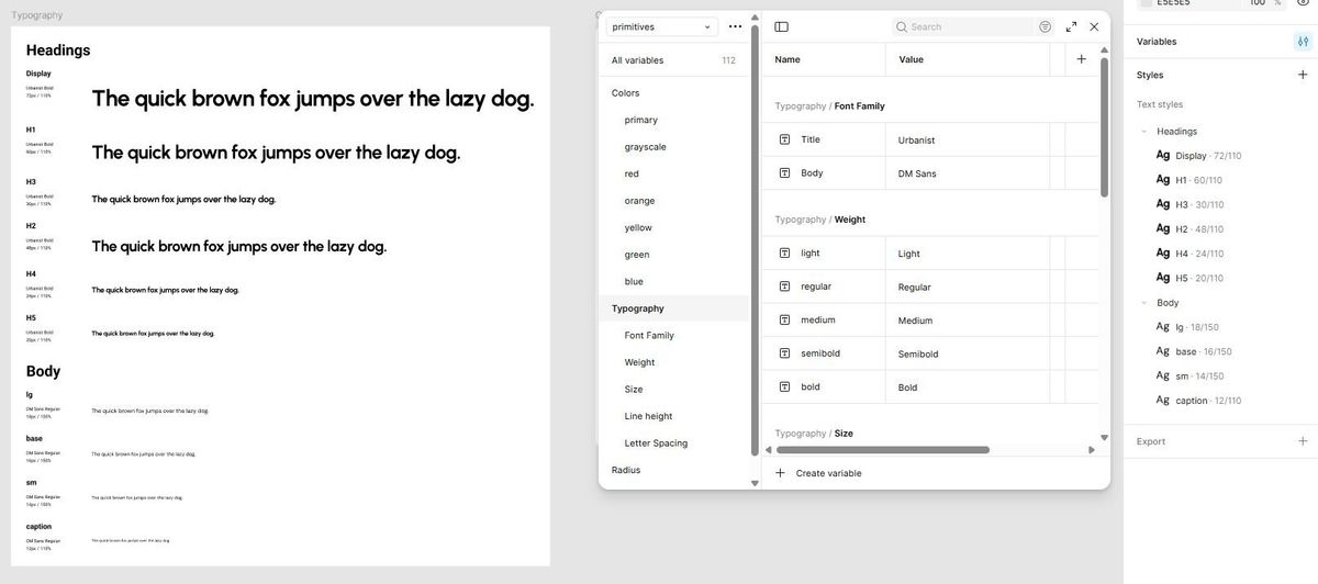
One limitation of variables is that they only store one value. But typography often needs multiple values combined — like an H1 that has font family, font weight, font size, line height, and letter spacing all working together.
That’s where styles come in. I created text styles that link to my variables:
- Headings: display, H1, H2, H3, H4, H5
- Body text: lg, base, sm, caption
Each style pulls in the font family, size, and weight from the variables we created earlier. For line height and letter spacing, I added fixed values (since percentages aren’t supported as variables yet). Example:
- Display/H1: 110% line height, tighter letter spacing
- Body/Base: 140% line height, standard letter spacing
Now I can apply these text styles everywhere in my designs, and they’ll stay consistent. What this buys me is clarity. When I pick “Body / Base,” I’m choosing a role, not a pile of properties. And when the brand shifts or the product’s density changes, I update a handful of variables and the styles follow along—without renaming anything, without retraining my brain.
A tiny tip that helps: resist the urge to create “H2—but-a-bit-smaller” one-offs. If you need that often, it’s probably a real style (or a sign the scale needs a tweak).
A quick example: why this matters
Let’s say a new client comes in and asks for their product to feel “more editorial.” Instead of redesigning every text style from scratch, all I’d need to do is swap out the title font variable for something with more character (say, swapping Outfit for a high-contrast serif), maybe bump the base font size from 16px to 18px, and the entire system adapts.
Headings across the app take on the new serif, body text stays legible, line height already scales, and responsive modes still kick in on mobile. What used to be a tedious cleanup becomes a 10-minute update. That’s the leverage you get when variables do the heavy lifting.
What's next
Typography touches every screen, every flow, every message a product sends. Getting this system in place means I can spend less time fiddling with type and more time solving the actual design problems.
Next up: I’ll move on to spacing and layout tokens — the invisible glue that holds typography, color, and components together.