Building My Design System – Part 3: Spacing, Radii & Layout Variables
After colors and typography, the next foundation of any design system is the spatial language: the invisible rules that control how much space things take up, how far apart they sit, and how they’re shaped. These rules might not be as flashy as a headline font or brand color, but they’re what make a UI feel orderly and cohesive instead of chaotic.
If every margin, padding, or corner radius is chosen ad hoc, you quickly end up with a product that feels “messy,” even if nobody can quite explain why. Tokens for spacing, layout, and radii prevent that. They create a predictable rhythm — one that works across components and scales up seamlessly from mobile to desktop.
Spacing: the rhythm of your design
For spacing, I created a scale of variables in the primitives collection, ranging from very tight (xxxs = 2px) to very generous (xxxl = 64px). The steps are based on the familiar 4px / 8px increments, because those are both flexible and easy to remember.
You don’t need every step on every screen, but having a scale defined upfront means you’ll never be stuck asking “should this margin be 13px or 15px?” Consistency matters more than the exact number.
For example:
- xxxs (2px) → hairline spacing, icon padding
- sm (8px) → small gaps inside components
- lg (24px) → section spacing on desktop
- xxxl (64px) → page-level padding, hero sections
Radii: shaping your brand personality
Corner radius is one of those subtle decisions that says a lot about a brand. Sharp corners feel professional and strict; rounded corners feel friendly and casual. Instead of making this decision on the go, I defined a clear radii scale:
- none = 0px
- xs = 2px
- sm = 4px
- md = 8px
- lg = 12px
- xl = 16px
- xxl = 24px
- round = 9999px (for pills and circles)
This way, you can apply “md radius” across buttons, inputs, and cards and be confident they’ll all feel consistent.
Responsive Layout Variables
Spacing and radii cover the micro-scale. But for macro layout — the overall structure of a page — I added another layer in the responsive collection.
Here, I defined three breakpoints as variable modes:
- Mobile → 390px
- Tablet → 768px
- Desktop → 1440px
For each breakpoint, I set up layout grid variables:
- columns → how many units to divide the page into
- margin → padding at the edges of the screen
- gutter → spacing between columns
These grid tokens give you a foundation for building responsive layouts in a way that stays consistent. For example, if your desktop layout uses 12 columns with a 24px gutter, and your tablet layout shifts to 8 columns with a 16px gutter, you don’t need to reinvent the wheel every time. The variables handle it.
Why it matters
Setting up spacing, radii, and layout tokens might feel “basic,” but they’re the scaffolding that holds your UI together. With these tokens in place, your product gets:
- Consistency → margins, paddings, and grids always align
- Scalability → changing a breakpoint or gutter size is one variable update, not a full redesign
- Brand personality → radii in particular signal tone subtly but strongly
In other words: your typography and colors might define the “voice” of your system, but spacing and layout define the structure. Without them, everything collapses into visual noise.
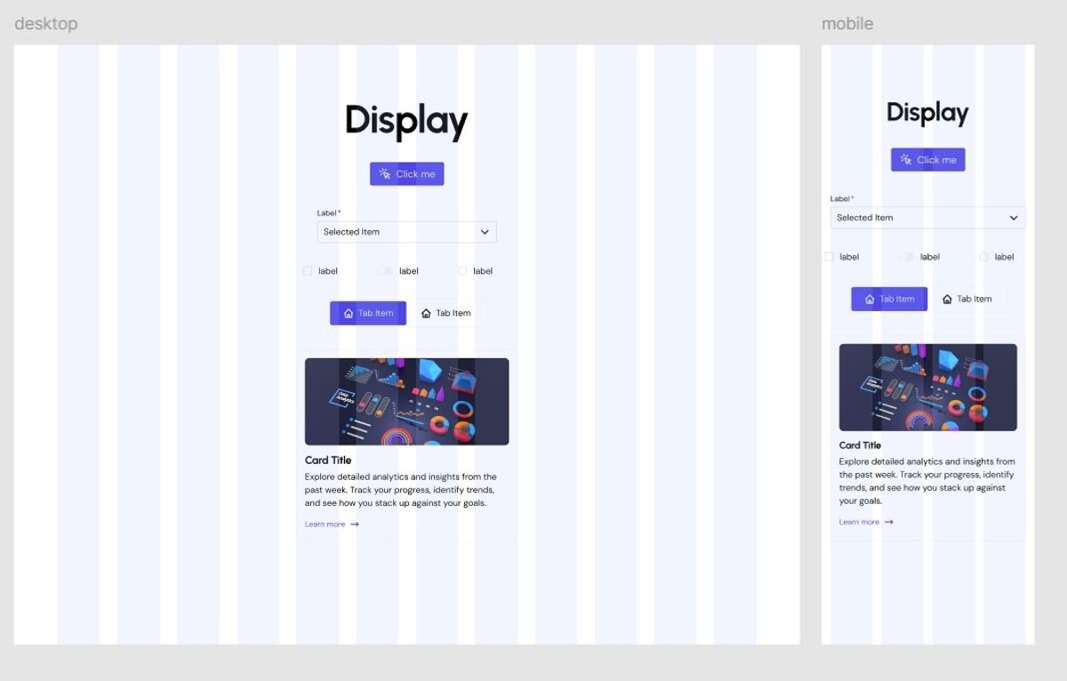
Putting It All Together: A Card Example
Tokens on their own are useful, but they really shine once you apply them in actual components. Let’s take something simple but common: a card.
On desktop, the card sits inside a 12-column grid. Using the layout tokens, you give it consistent side margins and gutters that match the rest of the page. The card itself has a radii.lg value for its corners — big enough to feel friendly but not so large it looks like a button. Inside the card, spacing.md separates the title from the body text, and spacing.lg adds comfortable breathing room between the card’s edge and its contents.
Switch to tablet mode, and those same tokens adapt. The grid variables redefine the number of columns and margins, so the card automatically resizes in a way that still feels intentional. Spacing tokens keep the internal padding consistent, while the radius stays the same across breakpoints, maintaining a recognizable look.
Finally, on mobile, the layout tokens kick in again: fewer columns, narrower gutters, and a more compact card. The internal spacing tokens mean the content still breathes, and because the radii tokens are shared across all breakpoints, the visual identity is intact.
By relying on variables instead of one-off values, you don’t need to “fix” the design at each size. The system just works — cards, buttons, forms, and any other component will follow the same rhythm.
A Note on Shadows
You might notice I didn’t define shadow tokens yet. That’s intentional. Spacing, radii, and layout are structural — they form the skeleton of your design system. Shadows, on the other hand, are more stylistic and often tied to the brand’s look and feel. I plan to add them later. When I do, I’ll treat them just like the other primitives: a set of named tokens (shadow.sm, shadow.md, shadow.lg) that can be applied consistently across components.