Building a Button Component Using Figma Variables
Over the last three posts, we built the foundation: colors, typography, and spacing/radii in Figma. We set up our variables so they’re reusable, consistent, and ready to power any design.
Now it’s time to stress-test them — and we’ll do it with one of the most universal components: buttons. Variables are great on paper, but can they hold up in real components? Can you build a full button system using only your tokens — no one-off overrides, no sneaky custom values? If yes, your foundation is solid. If not, you’ll spot exactly where your setup needs tweaking.
Buttons are the perfect first step because they touch almost every type of token you’ve created: colors, typography, spacing, radii, and even icons. Once you see how a token-driven button system works, the same principles can be applied to other components like input fields, cards, alerts, etc.
Why components matter: they bundle your tokens with interaction patterns so you don’t reinvent the wheel every time. A button isn’t just a color swatch; it’s color, typography, shape, padding, hover states, disabled states, all working together. Once your components are set up, you can design faster, stay consistent, and scale across projects without headaches.
Think of components as “dishes” and variables as “ingredients.” You can have the best ingredients in the world, but until you cook them into a dish, you’re still staring at raw food.
Buttons: The Teaching Example
I always start with buttons because they're everywhere in interfaces, but more importantly, they're the perfect testing ground for your entire variable system. A well-designed button component will touch almost every type of token you've created — colors, typography, spacing, border radius — and if your setup can handle all the variants and states buttons need, it can handle anything.
Finding the right variants for your needs
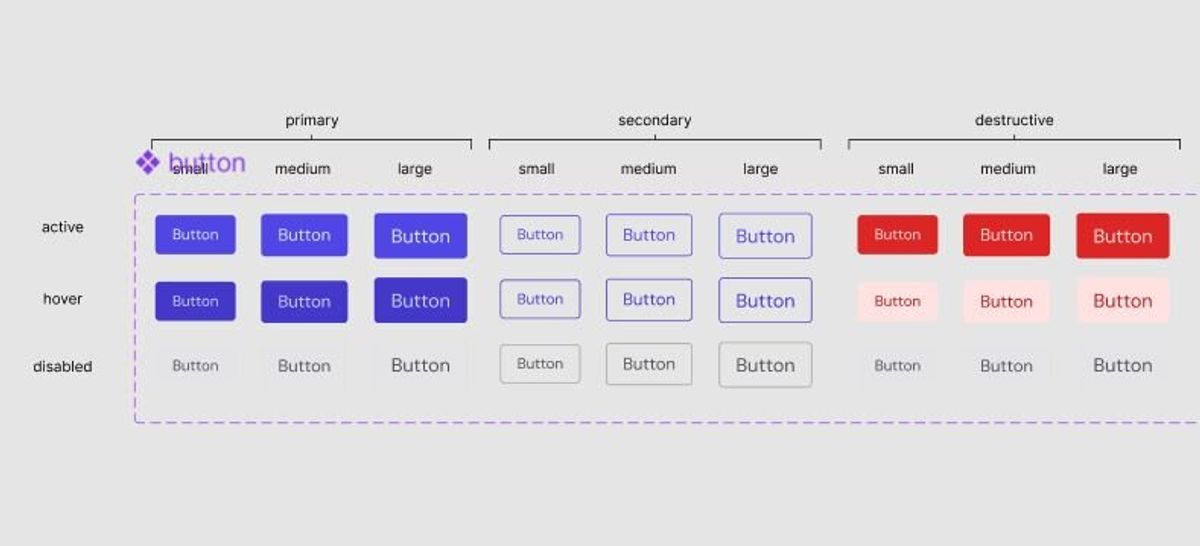
I went with five button variants: primary, secondary, ghost, neutral, and destructive. But honestly, I started by thinking about what I actually use in most projects. You might not need all of these — ghost buttons aren't essential for every interface, and neutral buttons are more of a nice-to-have for complex layouts.
The key is starting with what you know you'll use repeatedly:
- Primary: The main action you want users to take
- Secondary: Important but not primary actions
- Destructive: Delete, remove, or other potentially harmful actions
You can always add ghost or neutral variants later when a project calls for them. Don’t overthink it upfront.
How I connected the variables
Here’s how I tied semantic tokens to button states. I’m showing the primary button in full detail so you can see the logic:
Active:
- Background → Surface/brand/default → Colors/primary/600
- Text → Text/brand/on-brand → Colors/neutral/0
Hover:
- Background → Surface/brand/hover → Colors/primary/700
- Text → Text/brand/on-brand
Disabled:
- Background → Surface/neutral/subtle → Colors/neutral/200
- Text → Text/neutral/subtle → Colors/neutral/500
The secondary button follows the same pattern but swaps background for border tokens (outline style). The destructive button mirrors primary but uses the error color set (Surface/error/default, Surface/error/subtle, Text/error/default). Ghost and neutral buttons are lighter variants that mostly reference neutral surface and text tokens.
Typography and spacing decisions
Text sizes are tied directly to typography styles:
- Small → Body/sm (14px)
- Medium → Body/base (16px)
- Large → Body/lg (18px)
Spacing is consistent across all variants:
- Side padding → Spacing/md (16px)
- Top/bottom padding → Spacing/xs (8px)
- Icon gap → Spacing/xs (8px) when icons are present
Corner radius → Radius/sm (4px), picked consistently across buttons. This could be adjusted per brand if needed.
For spacing and radii, I’ve only set up primitives so far — all components share the same baseline values. That keeps things simple and consistent. That said, it does make sense to create semantic aliases in the future. For example, spacing/card/padding could reference spacing/sm so you can tweak card spacing without affecting buttons or inputs. Similarly, radius/button vs radius/card lets you adjust corners per component while keeping everything else consistent.
Icon integration that actually works
For icons, I didn’t just drop in SVGs — I pulled the Heroicons set from the Figma Community, turned them into components, and wired them into the button with two boolean properties: Icon left and Icon right. That way, you can toggle them on or off with a click.
Each icon slot is also hooked up to a variable instance swap, so you can switch which Heroicon is used without detaching anything.
The real power: change once, update everywhere
This setup means adapting the system for a new brand or project requires almost no component edits. Need a green brand instead of purple? Update the primary color primitives. Want to tweak typography? Adjust the typography styles. For spacing and radii, primitives ensure consistency for now; but I might add semantic aliases later so it will be more future proof.
Conclusion
By building a token-driven button system, you’ve seen how semantic colors, typography, spacing, and radius primitives come together in a real component. Buttons cover almost every use case you’ll encounter in interfaces: active/hover/disabled states, variants like primary, secondary, and destructive, text and icons — all powered by variables.
I’ll tackle more components like input fields, cards, and alerts in future posts, showing how the same token system scales across forms, layouts, and feedback patterns. But if you’ve followed along here, you already have the framework to design faster, stay consistent, and update everything in one place.