I Built My Personal Website with Builder.io — Here’s How It Went
For the longest time, I didn’t have a proper personal website.
Not because I didn’t want one — quite the opposite. I had ideas, designs, even half-built pages scattered around. But between client work, side projects, and tinkering with new tools, my own site kept getting pushed down the list.
Still, I knew it was time. I wanted a place to bring everything together — my projects, my process, my voice. A home for my work and ideas, not just a portfolio but a proper base for my personal brand.
I had already designed the site in Figma (of course), but when it came to building it, I had options: ask my partner (Hi, Matija) to code it, try Webflow, maybe even use Figma Sites. But recently I’d been working more and more with Builder.io on client projects — so I figured, why not see how far I can take it for myself?
Why Builder.io?
I first came across Builder.io like 1-2 years ago. I was curious about how well it could turn Figma designs into actual code — not full sites or pages back then, mostly just smaller sections or components. I played around with it here and there, and it became a handy tool when my partner and I needed to move quickly and connect design and development.
Things got more interesting when someone reached out to me for a project where Builder was the main tool — building pages directly with its visual editor. That’s when I really started digging into what it can do.
From there, I began using it more deliberately in client work — like making an About page for a Shopify store that lives outside Shopify, so the client can update it themselves without losing any design flexibility. It’s been pretty cool to see how it helps make things smoother for everyone.
So when I finally got serious about making my own site, it felt like a good chance to put Builder to the test.
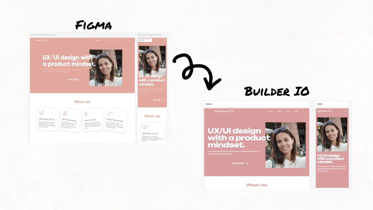
From Figma to Live Site
I started the usual way — designing everything in Figma. Then I brought those designs into Builder with their plugin and began tweaking things directly in the visual editor. It took a bit of adjusting to get the layout and responsiveness right, but overall it gave me a lot of flexibility to turn the designs into something functional.
The biggest challenge came with translating more complex Figma layouts into Builder. My hero section had an overlapping title and image design that looked great in Figma but doesn't play nicely with Builder's structure. I knew this going in — Builder works best with clean, grid-based layouts with proper auto-layout — but I really wanted to keep that visual impact.
I ended up solving it directly in Builder using custom margins, tweaking each breakpoint individually to get the responsive behavior right. Not the most elegant solution, but it worked and taught me where Builder's sweet spot is versus where you need to get creative. While I was polishing the homepage, I also added some slide-in animations on scroll — the kind of subtle movement that makes a site feel more alive without being distracting. Builder's animation options are pretty intuitive; you can set triggers and timing right in the visual editor without diving into CSS or JavaScript.
Since Builder is usually used to power specific parts of a site (like a landing page or CMS-driven blog), using it to build an entire personal site was a bit of an experiment. You still need a proper frontend to tie everything together — that’s where Matija helped me connect things on the code side. The navigation and footer, for example, aren’t built in Builder, but everything in between is.
I ended up designing and setting up the homepage, projects overview, individual project pages, the blog overview, blog article pages, and a contact page. For the projects and blog sections, this was my first time really diving into Builder's data models — and it turned out to be surprisingly straightforward. I used the data models to structure the content, defining fields like title, description, image, and tags once and reusing them across different pages. This made it easy to spin up detail pages for each project using the same template — create the template once, then just feed it different data for each project or blog post.
The contact form setup on the contact page was surprisingly smooth too. I used Builder’s built-in form components and connected it so submissions land straight in my inbox. It was simple to set up and works just fine for now.
A few workflow quirks I discovered: The visual editor preview can get stuck sometimes, making things look broken when they're actually fine. I learned to refresh the preview regularly rather than spending time 'fixing' things that were already working correctly. Also, Builder used to let you edit desktop and mobile views side-by-side in the visual editor, which made responsive design much smoother. Recently that seems to have changed — now I have to switch to mobile-only view to make mobile-specific edits. Not sure if it's a bug or an intentional change, but it definitely slows down the workflow a bit.
Lessons from Building My Whole Site in Builder
Building my personal site was one of those projects I'd been putting off for a while, and using Builder.io to finally get it done taught me as much about my own work process as it did about the tool itself.
On choosing the right moment: Sometimes the best way to learn a tool deeply is to use it for something that matters to you. I'd used Builder on client projects before, but building my own site pushed me to explore features I might have skipped otherwise — like the data models and form handling. When it's your own project, you're more willing to experiment and solve problems creatively.
The design-development handoff, simplified: One of the biggest wins was how much smoother the collaboration with Matija became. Instead of detailed handoff docs and back-and-forth about spacing and layout details, I could build most of the visual experience myself and just needed him to connect the infrastructure. It changed our dynamic from "designer hands off to developer" to "designer builds experience, developer handles the plumbing."
Content strategy meets technology: Using Builder's data models forced me to think more systematically about my content structure. Instead of designing each project page as a unique snowflake, I had to consider: what fields do all my projects share? How should blog posts be structured? This constraint actually made my content more consistent and my site easier to maintain.
The reality of "no-code" tools: Builder positions itself as bridging the gap between designers, marketers, and developers — and that's actually pretty accurate. It's not as plug-and-play as Framer, where you can go from design to live site in minutes, or as comprehensive as Webflow with its full hosting and CMS ecosystem. Builder sits in this interesting middle ground where having some HTML/CSS knowledge definitely helps, but isn't required. A developer could set up custom components and a marketer could just drag and drop sections, or someone like me with basic front-end knowledge can push it further. The trade-off is flexibility: you get more control than pure no-code tools, but you also need more technical setup. It's "low-code" rather than "no-code" — perfect if you want that middle ground between ease and power.
Speed vs. perfection: The biggest lesson was about momentum. I could have spent months building a completely custom site, tweaking every interaction and perfecting every detail. Instead, I got something live and functional in a fraction of the time. Is it perfect? No. But it's mine, it works, and I can iterate on it. Sometimes the best tool is the one that gets you from idea to reality fastest.
The whole experience reinforced something I've been thinking about a lot lately: the right tool isn't always the most powerful one — it's the one that best matches your constraints and goals. For this project, at this moment, Builder hit that sweet spot perfectly.
What's next?
Now that the foundation is built, the real work begins. I've been publishing on Medium for a while, but having my own space feels like the right move — more control over the experience, and everything lives in one place.
The plan is to keep adding to the blog regularly (starting with this post, obviously) and expand the projects section as I work on new things. I want people to see not just what I've done, but get a sense of how I think and work. Maybe add some freebies down the line — templates, resources, that kind of thing.
Builder's data model system should make this pretty straightforward. Adding new blog posts or projects is just a matter of filling out the fields and hitting publish. No wrestling with code or complex CMSs.
I'm curious to see how the site evolves and whether Builder keeps up as I add more content and functionality. For now, it's exactly what I needed — a home for my work that I actually built myself, rather than another project I kept putting off.
If you're considering Builder for your own project, my advice is simple: think about where you sit on the technical spectrum and what you actually need to get done. It's not the right tool for everyone, but it might be exactly right for you.