I Keep Collecting Page Transitions. So I'm Building My Own Library.
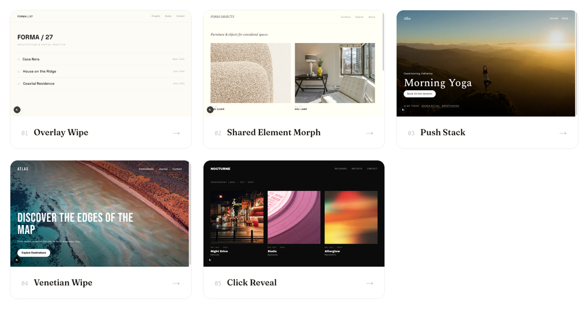
Some websites make moving between pages feel completely different from clicking a link.
The page doesn't just disappear and get replaced. A panel sweeps across the screen, the page underneath shrinks away, an image you just clicked continues seamlessly into the next one.
I love these details. They're small, and they completely change how a website feels.
Then I close the tab.
And a few months later I'm starting a project where that exact transition would have been perfect, and I can't remember which site it was on.
So I decided to build myself a small library of page transitions I can come back to and reuse.
Initially, it's really just for me. If it turns into something useful enough, I'll make it public on my site too.
What is a page transition, anyway?
At its simplest, it's what happens visually between one page and the next. That can be almost invisible — a crossfade — or a much more intentional part of the experience. A thumbnail grows into the hero image of the page you just opened. A new page slides over the old one like a stack of cards. A full-screen panel takes over while the next page loads underneath.
The interesting part isn't making navigation animated. It's deciding what the transition should communicate.
A shared element establishes a relationship between two pages. A push makes navigation feel spatial. A branded panel reinforces an identity. Sometimes motion just makes a site feel more cohesive and considered.
Not every website needs elaborate transitions. Sometimes the best one is barely noticeable. I'm interested in the ones where the motion actually adds something.
There are already some really good resources
I'm not the first person to care about this.
Motion has a page transitions section with a curtain set and a mask wipe, installable via shadcn, and they let you adapt the implementations with AI. The wider Motion UI library sits behind Motion+.
SSGOI takes a different approach — a more complete transition system built on the Web Animations API, working across React, Svelte, Vue, Solid, Angular and Qwik. The showcases rebuild Instagram, Airbnb and Pinterest. It speaks mobile-app language: drill, sheet, axis.
Underneath a lot of this is the browser's View Transition API, which animates between DOM states and, increasingly, between actual document navigations, using native functionality. Next.js published a guide for it recently.
So I'm not trying to solve a problem that doesn't have solutions. I just wanted something I would actually use.
I don't want a library of effects
This is probably the most important distinction for me.
It would be easy to make a collection of 30 flashy animations. That's not particularly useful. I'm more interested in interaction patterns than effects.
A shared element morph makes sense moving from a product grid to a product detail page:
thumbnail → hero image
An overlay wipe works for a brand-led site:
page → branded transition → page
A push-stack makes sense in something app-like, a wellness or booking experience:
current screen → recedes → next screen
So I'm pairing each transition with a context where it could actually belong. The question isn't "what website can I invent to justify this animation?" It's "where would this interaction make sense?"
How I'm building them
Next.js App Router, and the View Transitions API doing most of the work. Motion only where the browser can't handle it natively. Each one lives as its own small implementation I can lift out, not something tangled into a demo page.
So far I have five: an overlay wipe, a click reveal that expands outward from wherever you clicked, a push stack, a shared element morph, and a venetian blind wipe.
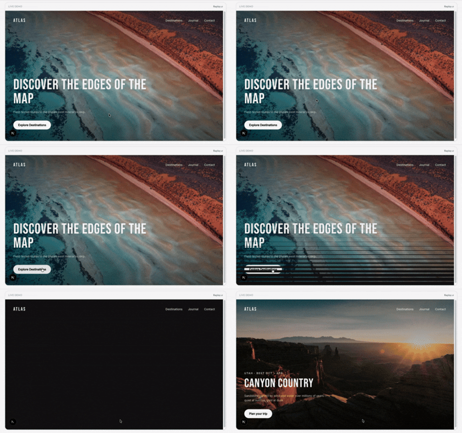
Once one is built properly, I can hand it to a coding agent and say: adapt this to the project you're in. Not "add a cool shared element transition to my website" — the actual implementation, the expected behavior, the edge cases, the design intent. The agent isn't inventing the interaction from a vague description. It has a concrete reference for what we're building.
That's the part I wouldn't have thought about a few years ago. The library is more useful as something I can point an agent at than as code I copy by hand.
The idea
When I'm starting a project and think a page transition could add something here, I want somewhere to go. A set of interactions I've already built, already tested, already decided are worth keeping — with a note on where each one makes sense.
And it keeps growing. Every time I land on a site that does something I like, that goes in too. It's never finished, it just gets bigger the longer I pay attention.
Building it for myself first
Honestly, I don't think the internet needs another page-transition library. I need one.
So I'm building them one at a time, testing them, working out which patterns are actually reusable. Once it's in a state I'd trust in real work, it goes public here.
I'll update this post when it does.